Sopot Tourism Organisation

In 2018, together with Studio Spectro from Gdańsk, I was invited to design a new, refreshed identity for the Sopot Tourism Organisation. Its existing logo was outdated, so the city of Sopot decided to rebrand the local Tourism Organization. The goal was to present a more attractive, modern, and fresh look for visiting tourists and to showcase local attractions through new materials.
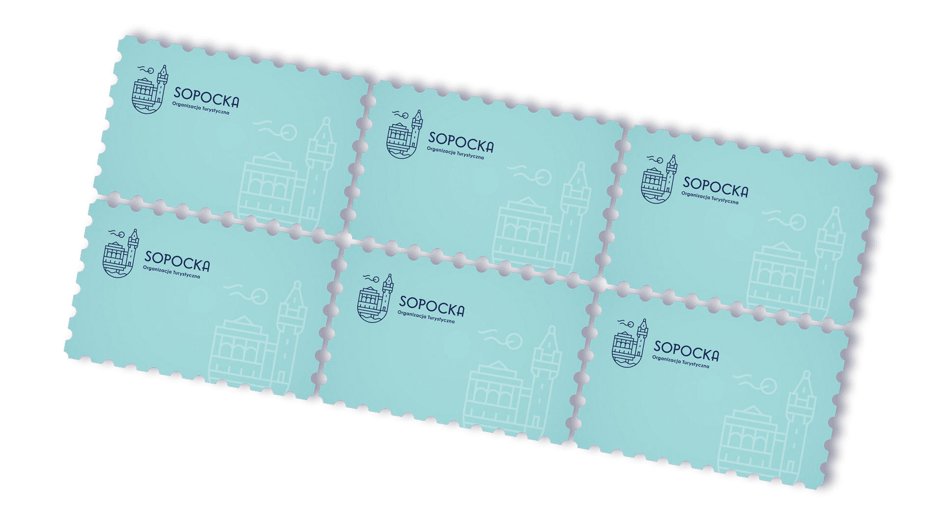
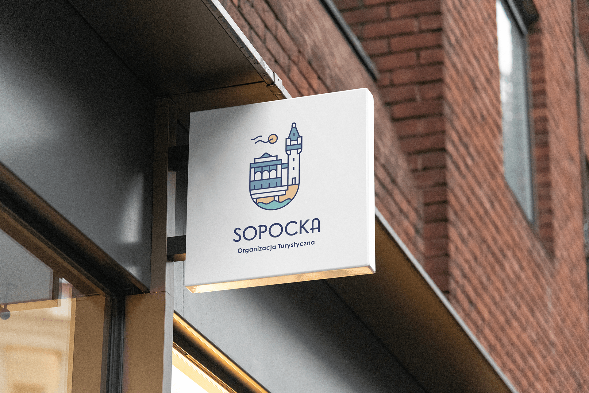
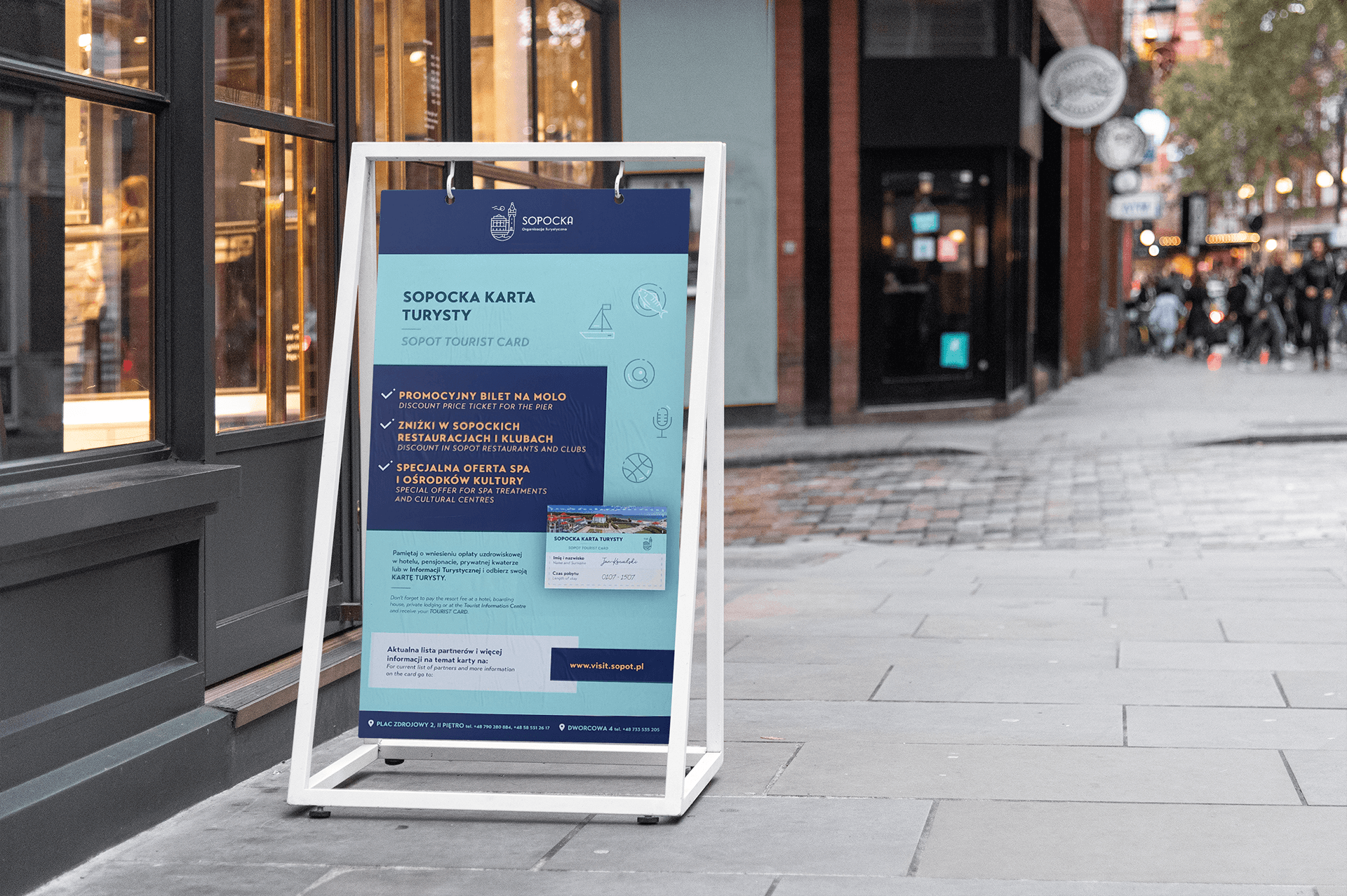
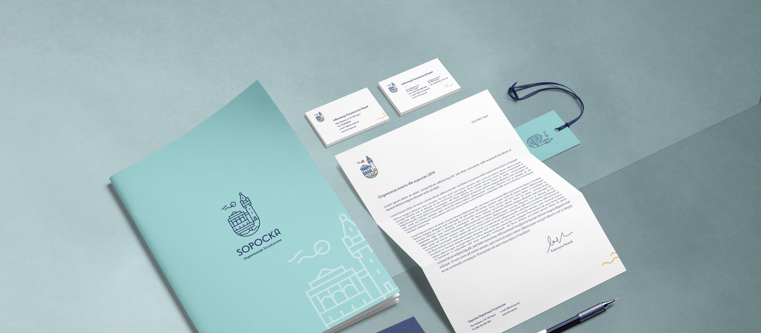
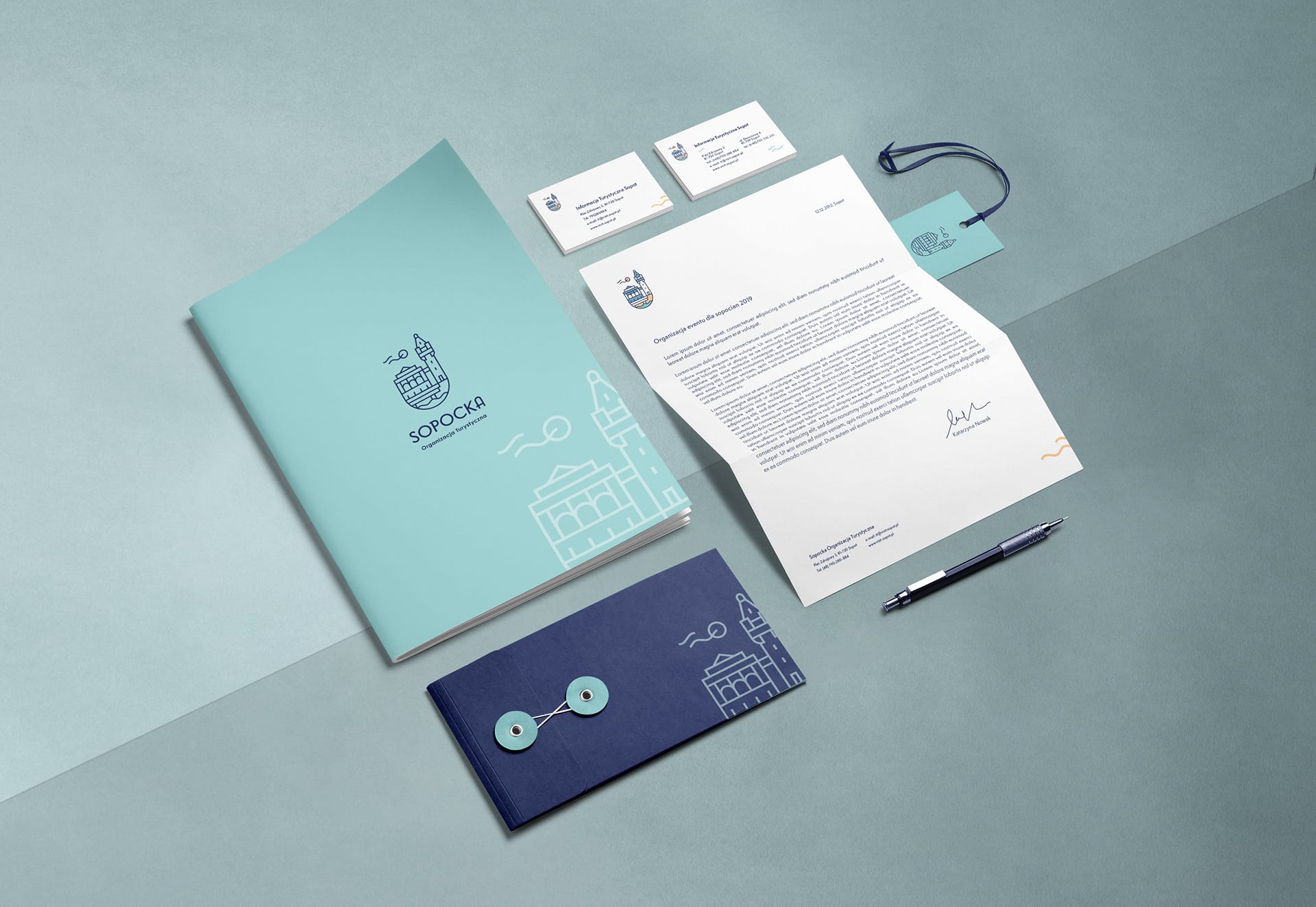
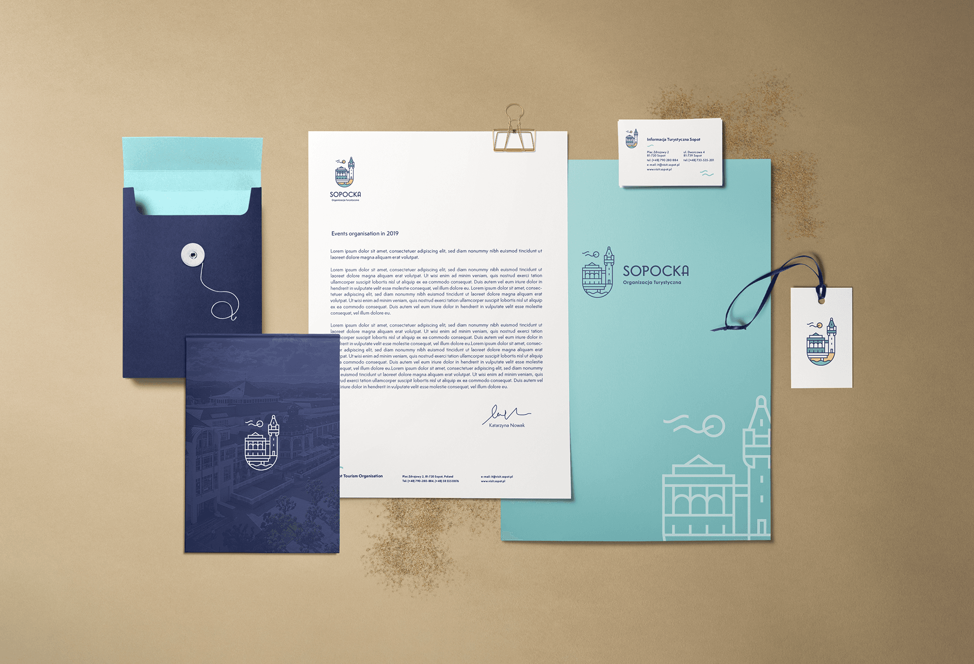
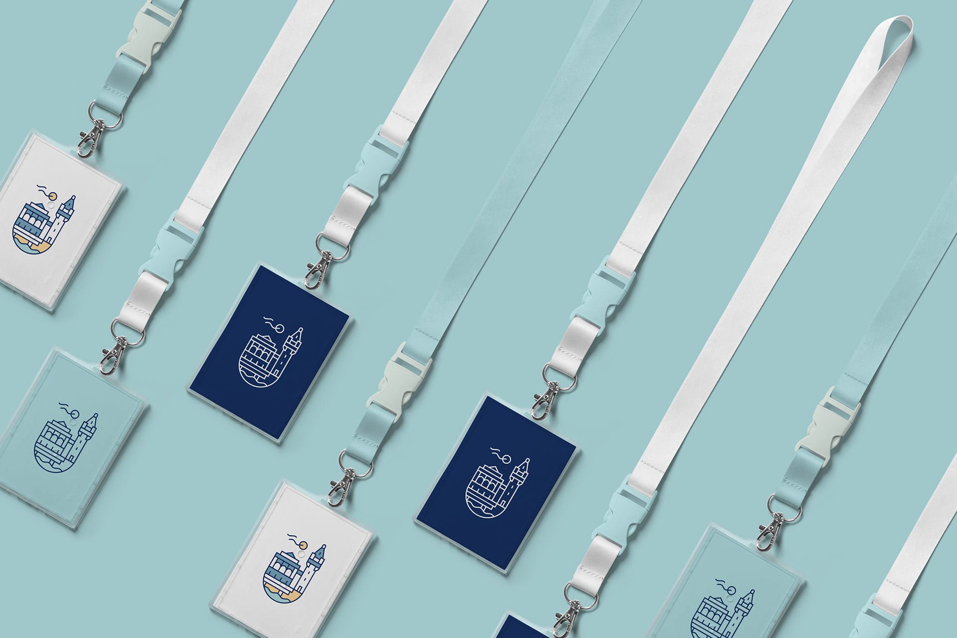
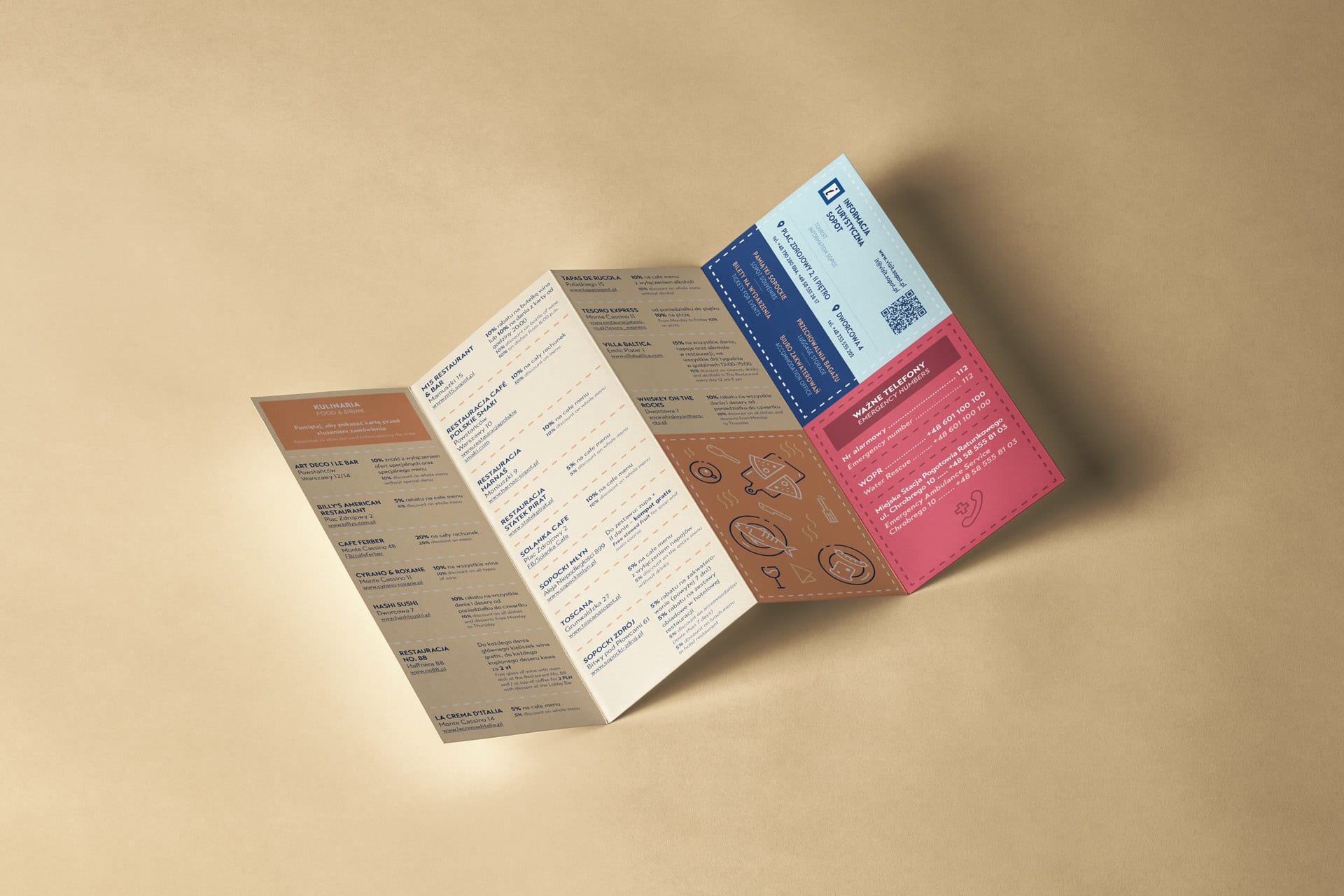
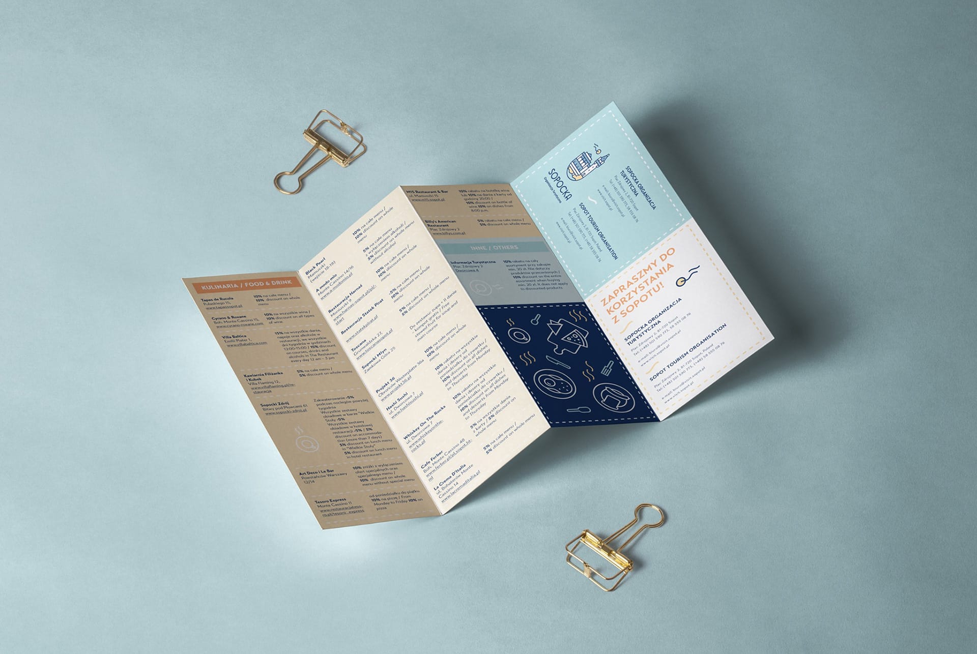
Under Studio Spectro’s art direction, I created the logo design, business cards, brand book, and letterhead, along with the new Sopot Tourism Card and its promotional campaign across the city of Sopot in Poland.
The project has been successfully implemented since early 2019, and it has been visible on the streets through its marketing campaign.
Task: Logo redesign & Brand Identity for Sopot Tourism Organisation
Software: Adobe Illustrator, Photoshop, InDesign and Procreate
Art direction: Gosia Macioch
Graphic design: Karolina Johnson
Early logo sketches & proposals
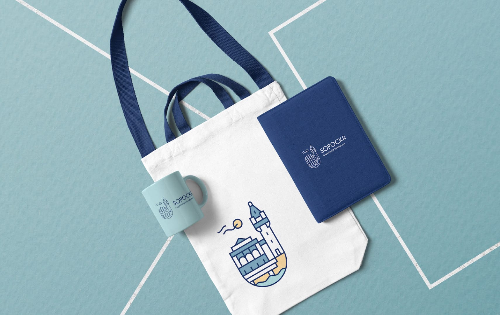
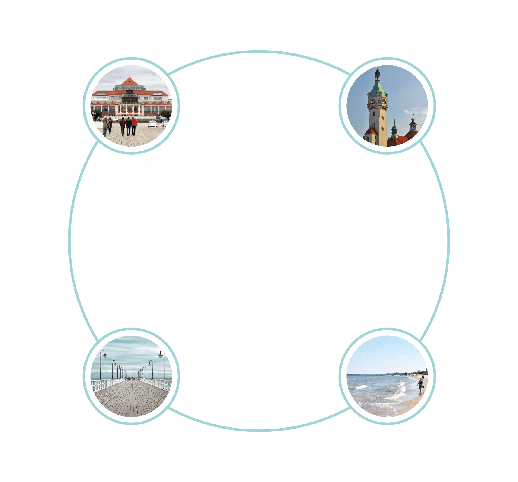
The idea behind the logo was to capture Sopot’s most significant attractions: the lighthouse, the Sopot Spa House, the Sopot pier, and the Baltic Sea. After reviewing the proposals, the first concept was chosen for further branding development.

Symbolism & meaning
The logo is a graphic representation of the four essential tourist attractions in Sopot, which have shaped the city’s image for many years.
Sopot is located in northern Poland. It’s a major health-spa, seaside, and tourist resort destination. It has the longest wooden pier in Europe, at 515.5 metres, stretching out into the Bay of Gdańsk.
The city is also famous for its Sopot International Song Festival, the largest such event in Europe after the Eurovision Song Contest. Among its other attractions is the Sopot Lighthouse, which once served as a navigation facility on the Polish Baltic coast.
Logo grid construction
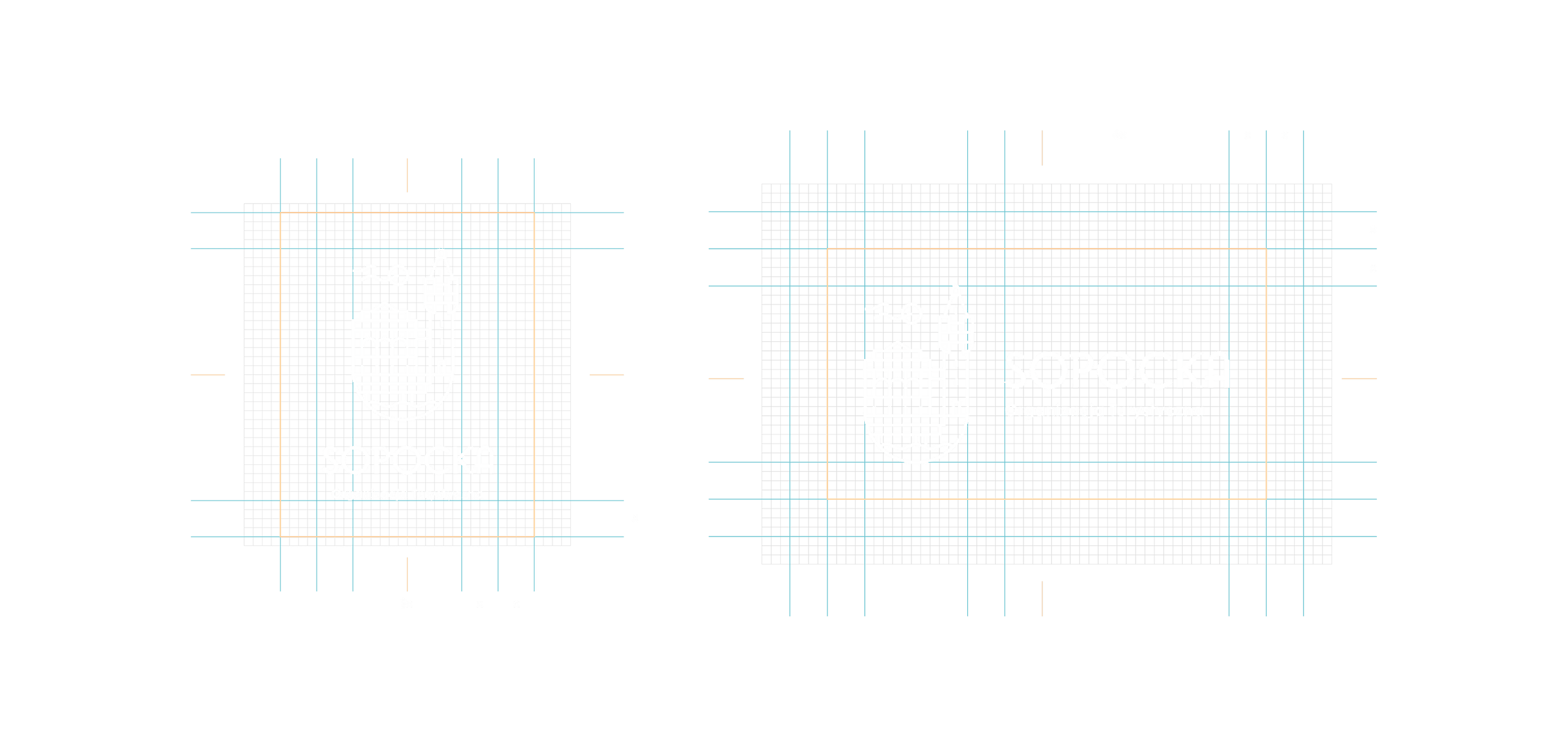
The final logo has a horizontal and a vertical version. It was designed on a detailed square grid and based on X-square proportions.
Color scheme
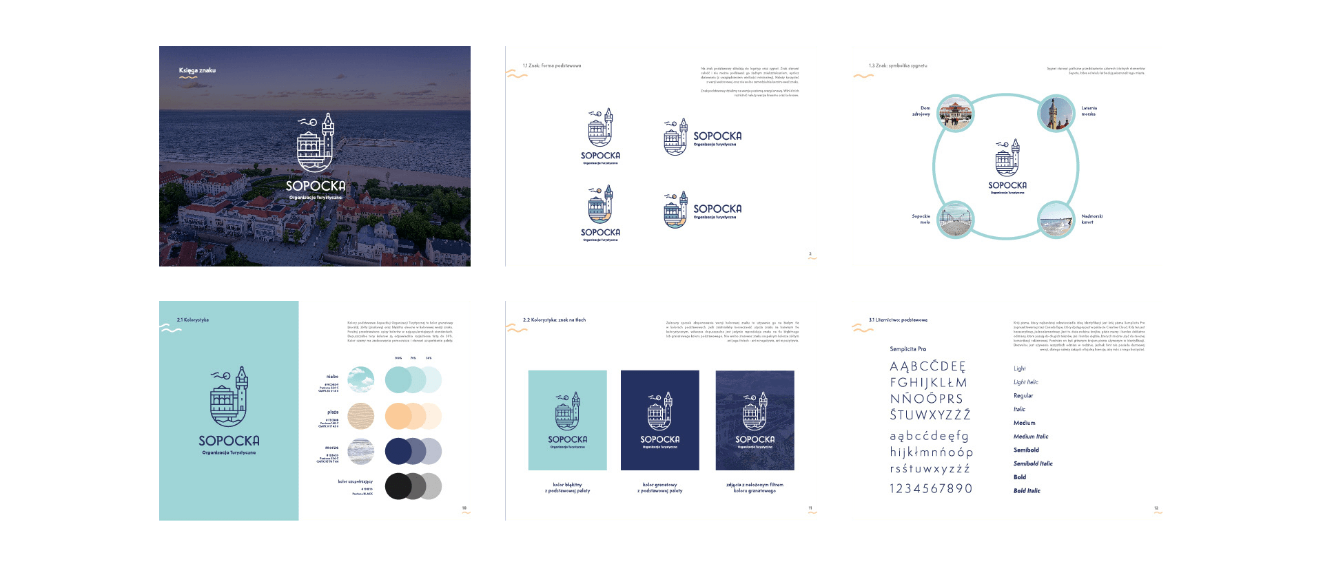
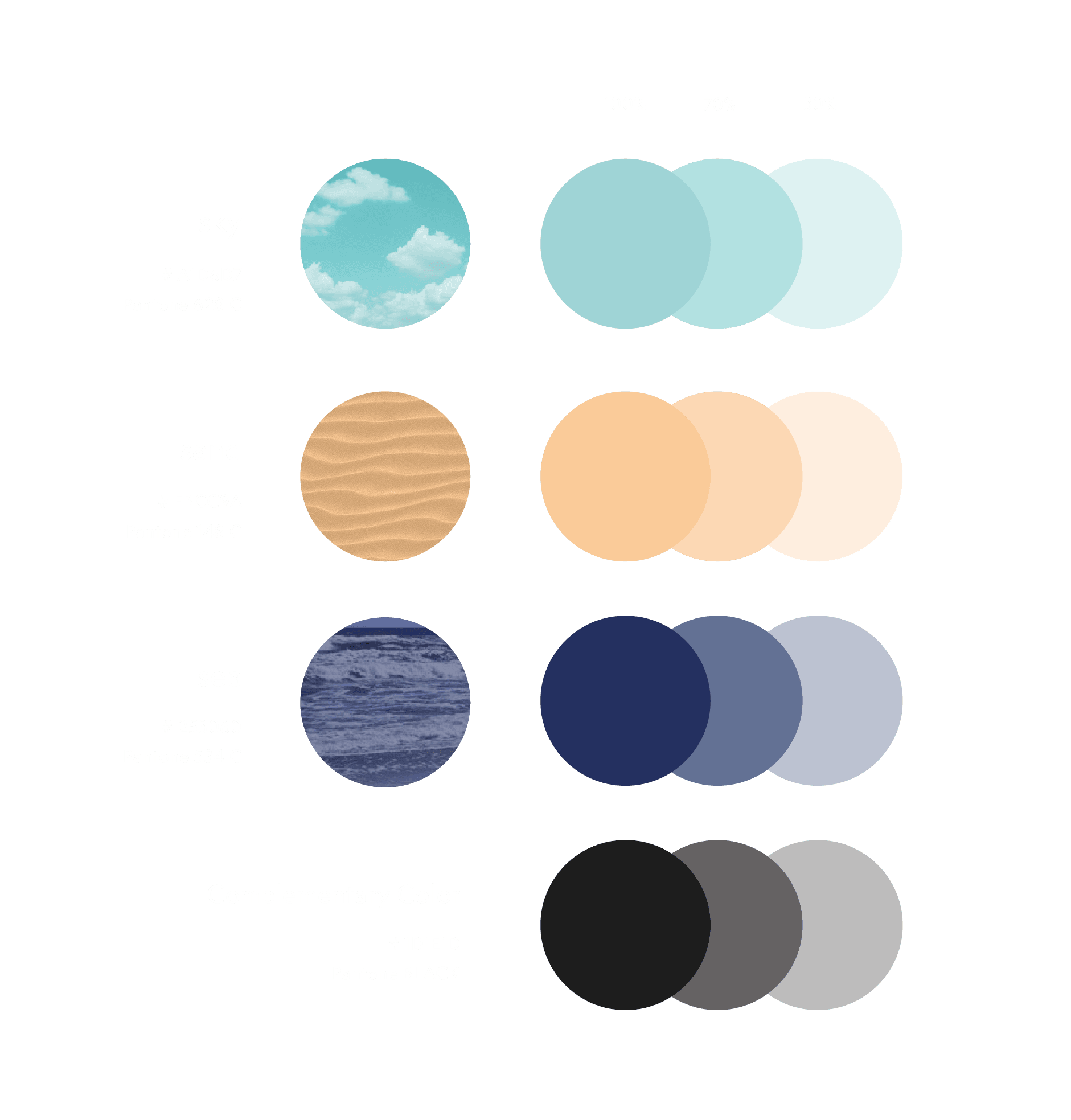
The core colors of the Sopot Tourist Organization are drawn from the local landscape: light blue represents the summer skies, yellow represents Sopot’s sandy beaches, and navy blue represents the Baltic Sea.
The colors are specified in Pantone and HEX codes. Permissible shades may be lightened with a tint of up to 30%. Black and white are auxiliary colors that complete the palette.
Typography

The primary typeface that best reflects the idea behind the Sopot Tourism Organisation branding is a sans-serif designed by Canada Type. It is a large type family with both delicate and heavy weights, well suited to outdoor advertising. (Semplicita Pro)
The complementary typeface used in the identity system is designed by Hanken Design Co. It’s a clear, simple sans-serif with a geometric style, and all weights in the family are permitted. (Now)
Brand book
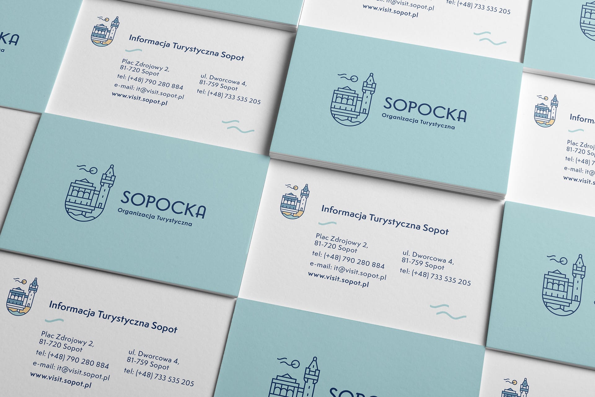
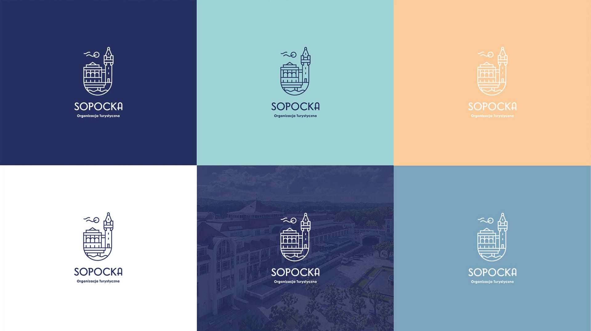
A brand style guide is a document that sets specific guidelines for maintaining brand identity across all external and internal communications. It covers the use of the logo, colors, typography, and symbolism, with examples of application on letterhead, business cards, and more.
The Sopot Tourist Organisation branding is summarized in the brand book linked below (Polish version).