Senior Product Designer

Product Designer
and System Builder

Senior Product Designer in fintech evolving from visual systems ownership into hands-on engineering collaboration — using AI to close the gap between design and code.

Karolina Johnson About

I design the rules before
I design the output.

The bulk of my work has been visual governance at scale — brand books that make 227 book covers consistent, identity systems that hold across 110+ member organisations, token architecture that governs color across six theme modes. I design the systems that make execution possible without design oversight on every application.

Right now I'm a Senior Product Designer at tastytrade, building trading experiences across iOS, Android, desktop, and web. Account opening, funding flows, platform UI — where clarity and trust are the real KPIs.

The current chapter is about closing the gap between design and code: AI-assisted workflows, design audits, token ownership, direct engineering collaboration.

Selected Work

Visual governance at scale.
Systems, not surfaces.

Brand Governance Identity System 2018–2021

Brand governance for a university's defining anniversary

The brief was a logo. The outcome was a visual governance system — coat of arms to street campaign, brand book to 900-page publication — that held a university coherent through its most public year.
26,000+Students governed
11Faculties · 3 campuses
900Page anniversary book
3 yrSingle system lifespan
Logo development process — University of Gdańsk 50th anniversary

A competition win with no ceiling on scope

Winning the University of Gdańsk's internal design competition in early 2018 was the entry point, not the scope. The university — founded March 20, 1970 through the merger of two institutions, now serving 26,000+ students across 11 faculties and 3 campuses — needed a governed visual identity for its 50th anniversary. The constraint was structural: a relatively young institution carrying over a thousand years of Gdańsk's civic identity, with a maritime motto (in mari via tua — your way in the sea) that ran deeper than its founding date. The system had to carry both. Celebrations were scheduled to open March 20, 2019 — the identity needed to be live a full year before the main anniversary date.

Logo as constitutional document

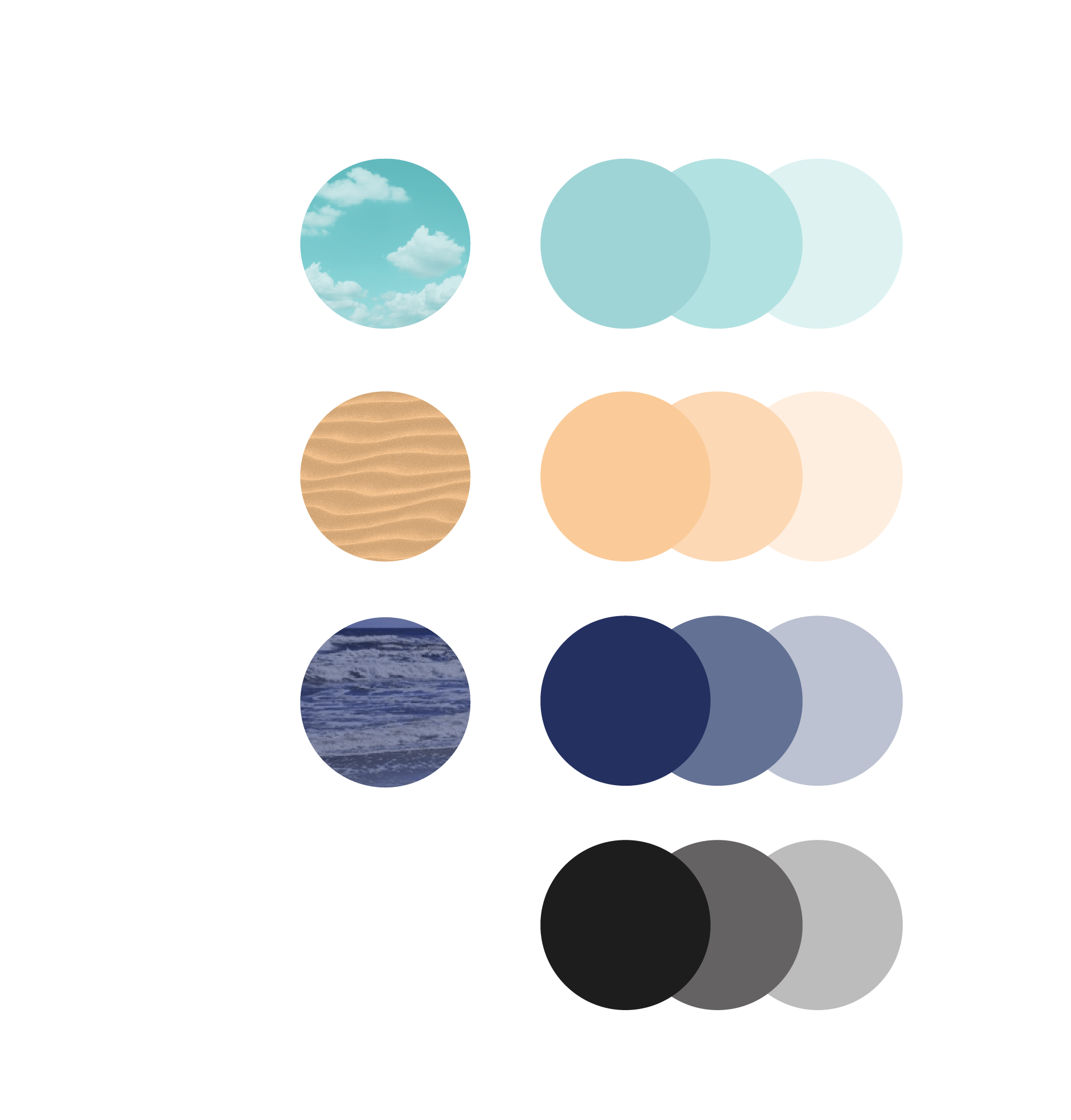
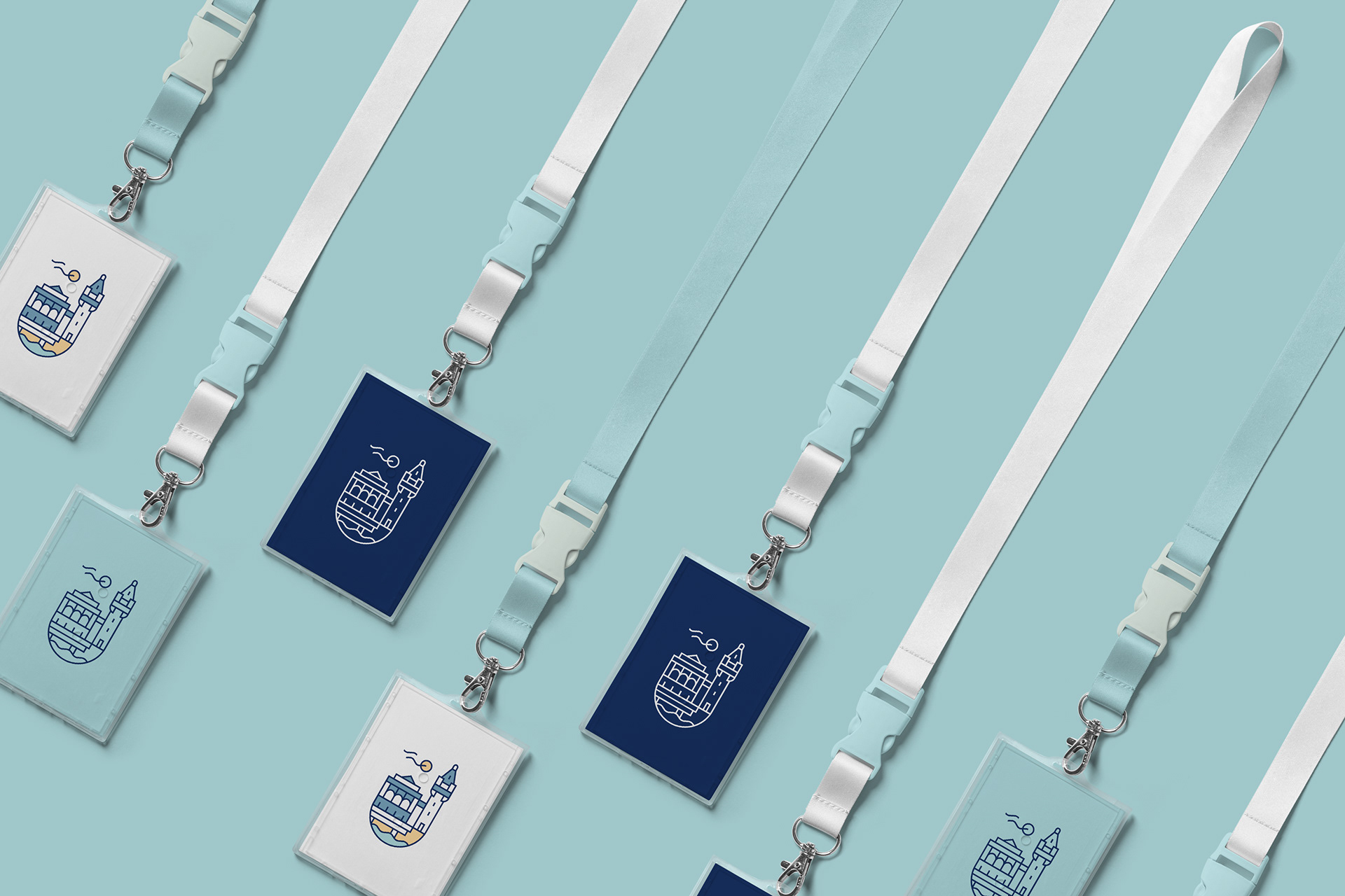
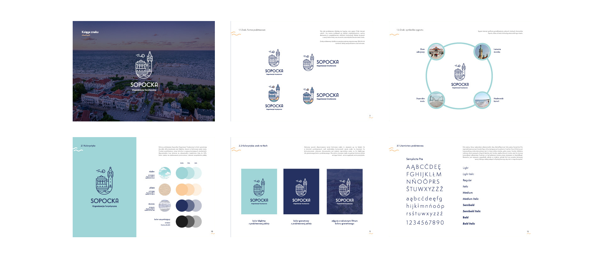
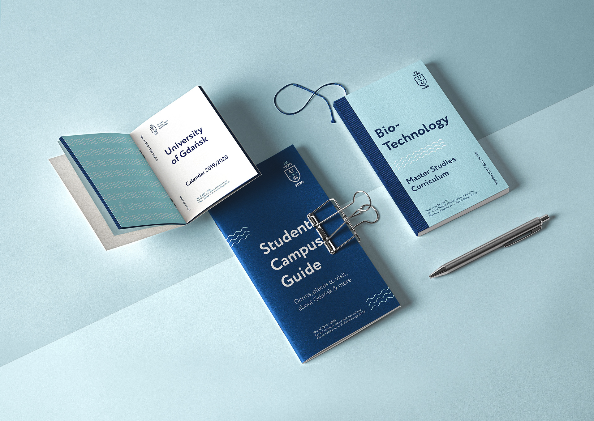
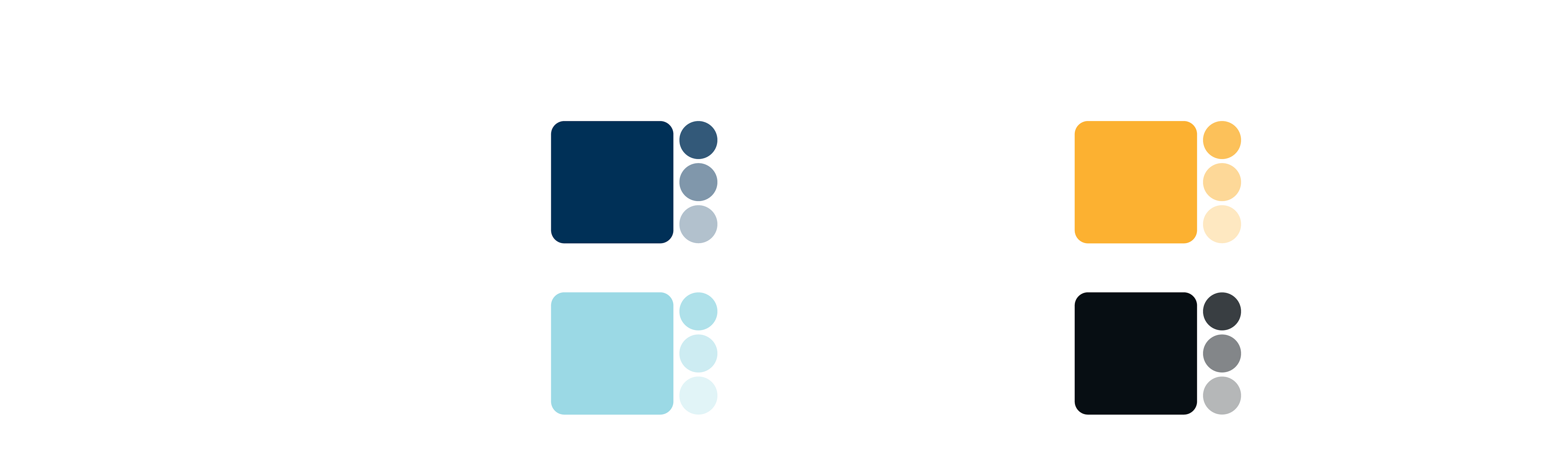
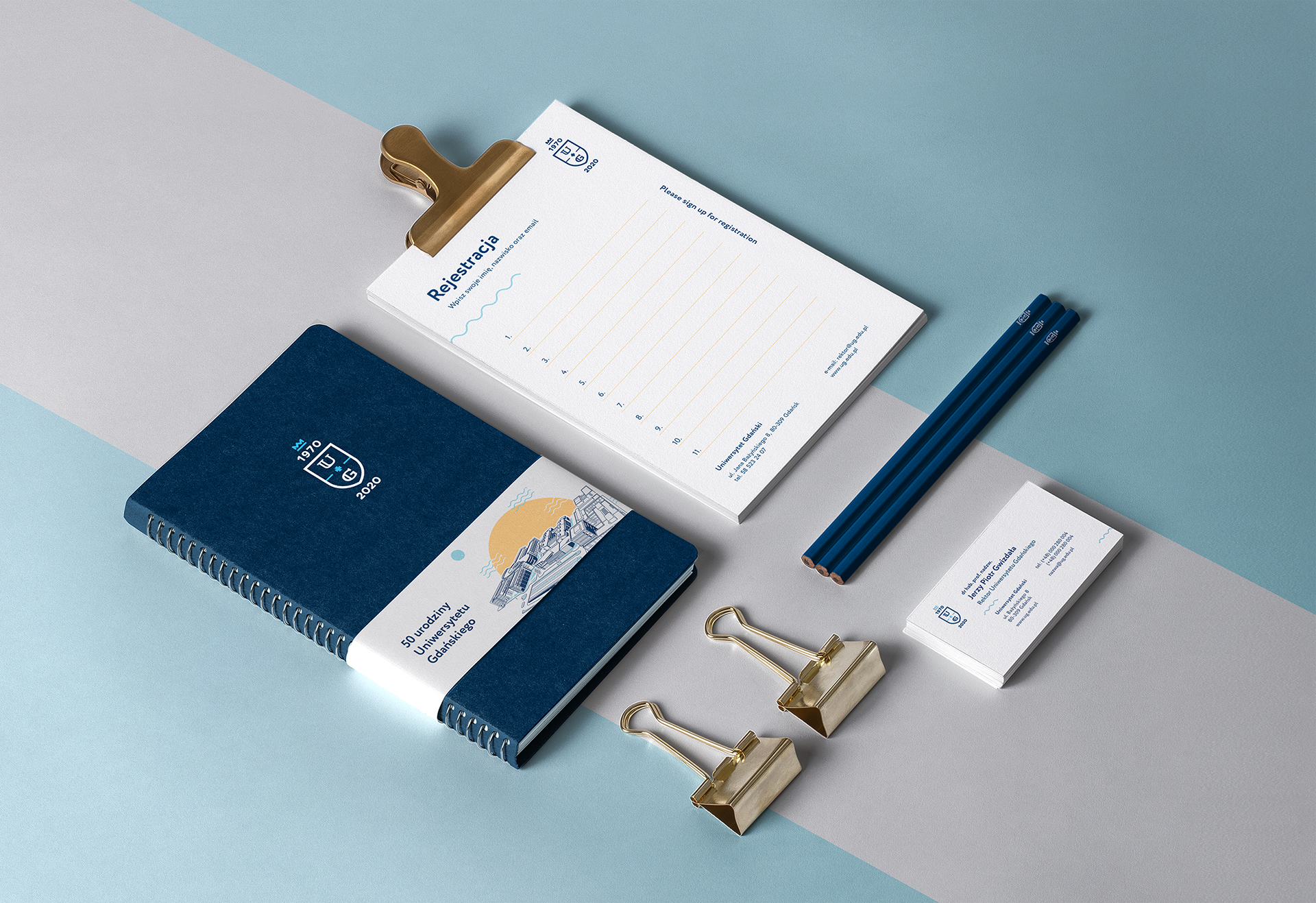
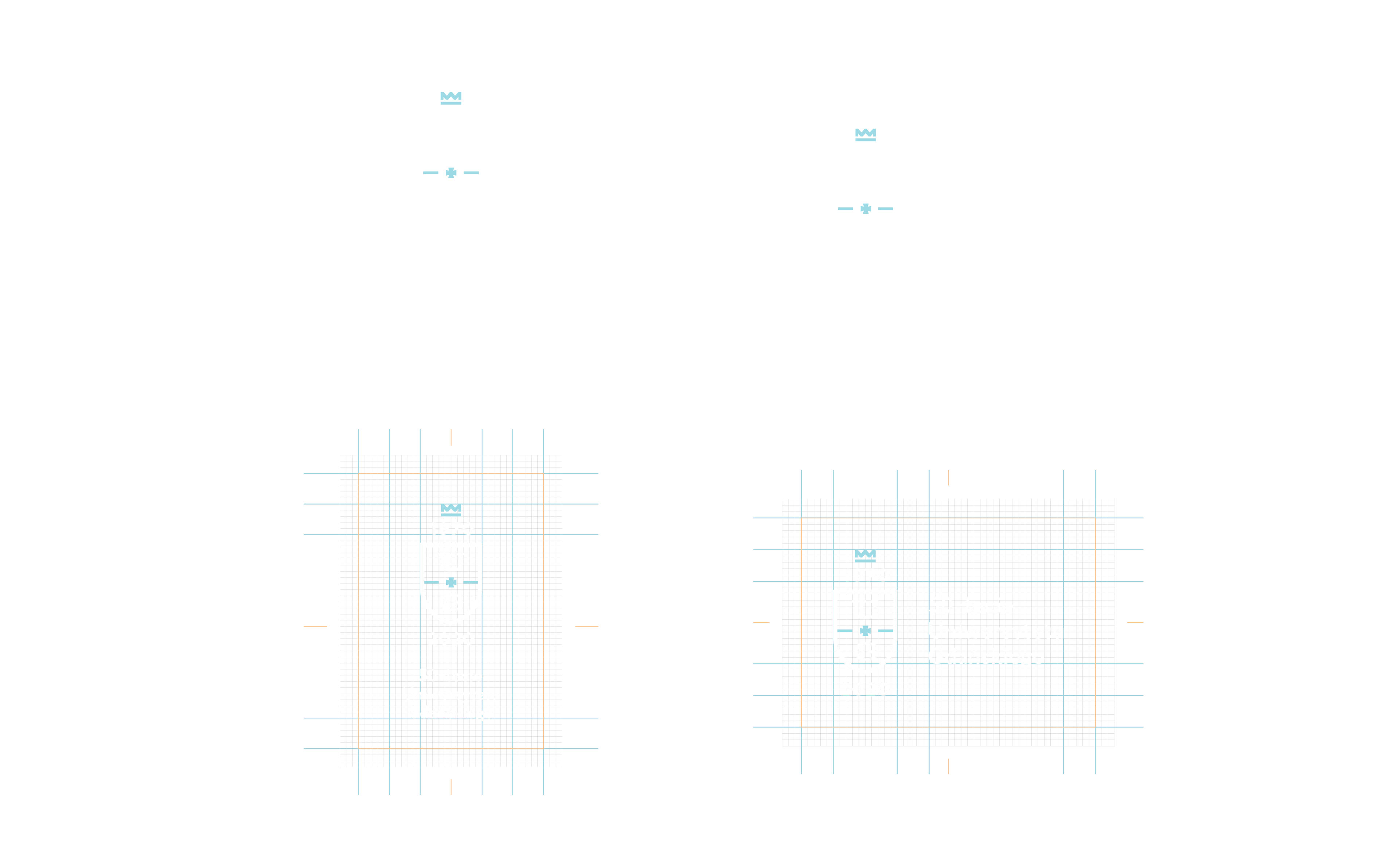
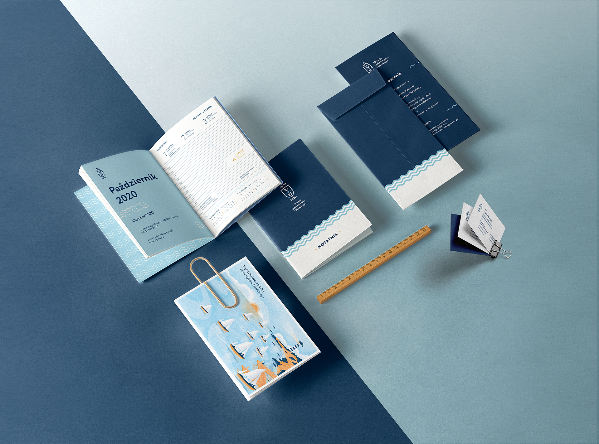
The mark brought together five specific elements — coat of arms outline with crown, founding year (1970), UG initials, the Gdańsk cross, and the anniversary year (2020) — governed by a strict construction grid. The decision to treat sigil and logotype as inseparable was a governance call: it prevented the mark from fracturing across applications as the system scaled across 3 campuses, 11 faculties, and 1,700 academic staff. The primary palette — navy blue, sky blue, white — was extended with amber and black as controlled complements, each defined by explicit use conditions. The primary typeface, Circe, was formally licensed by the university, giving the system legal continuity across every vendor and department.

Logo versions and grid construction Logo color versions

Color, type, and the rules that made the system transferable

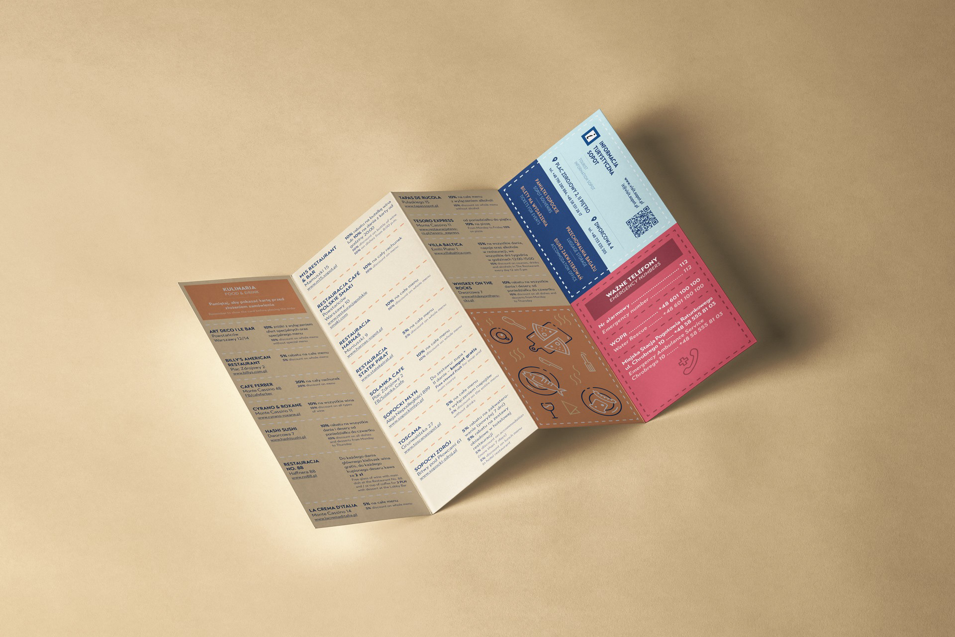
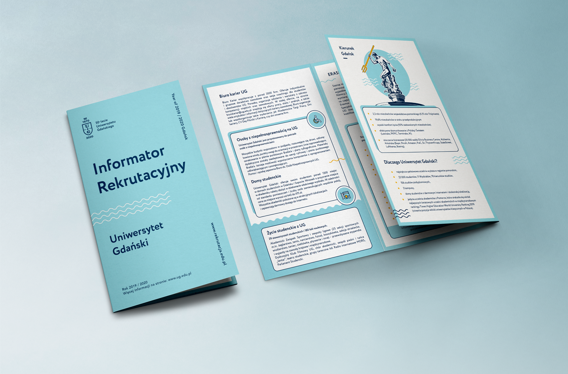
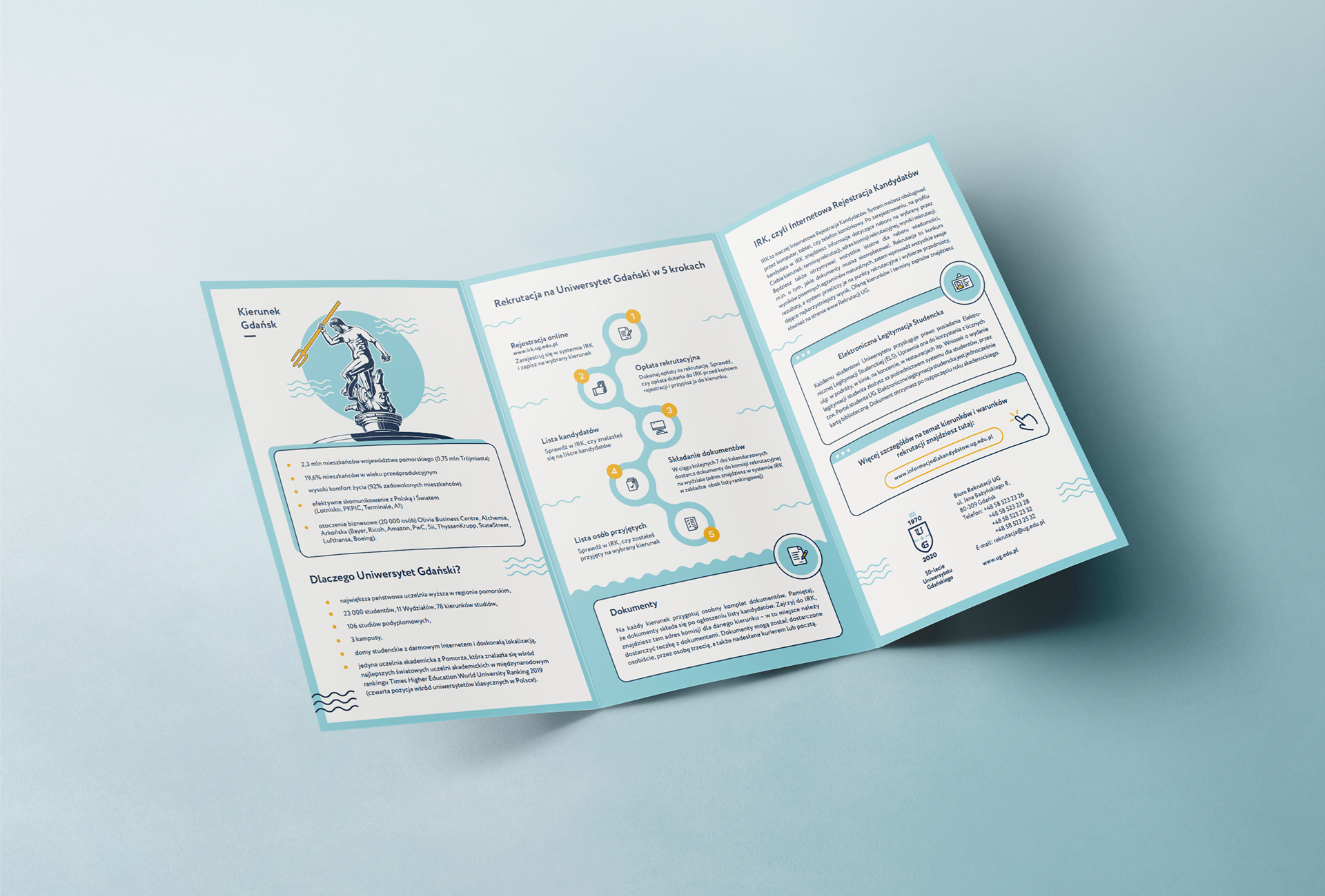
Color rules were written separately for print and screen — a practical necessity for a system running across Pantone-matched invitations and web-distributed materials simultaneously. Trebuchet MS was specified as the everyday staff typeface, keeping the system usable across the institution without requiring the primary license. The brand book codified every rule, making the identity transferable to vendors and departments without design oversight on each execution — critical at the scale of a university with 26,000 students, multiple faculties, and media patrons including TVP3 and Radio Gdańsk.

Color scheme overview Color palette Typography overview Brand book spread

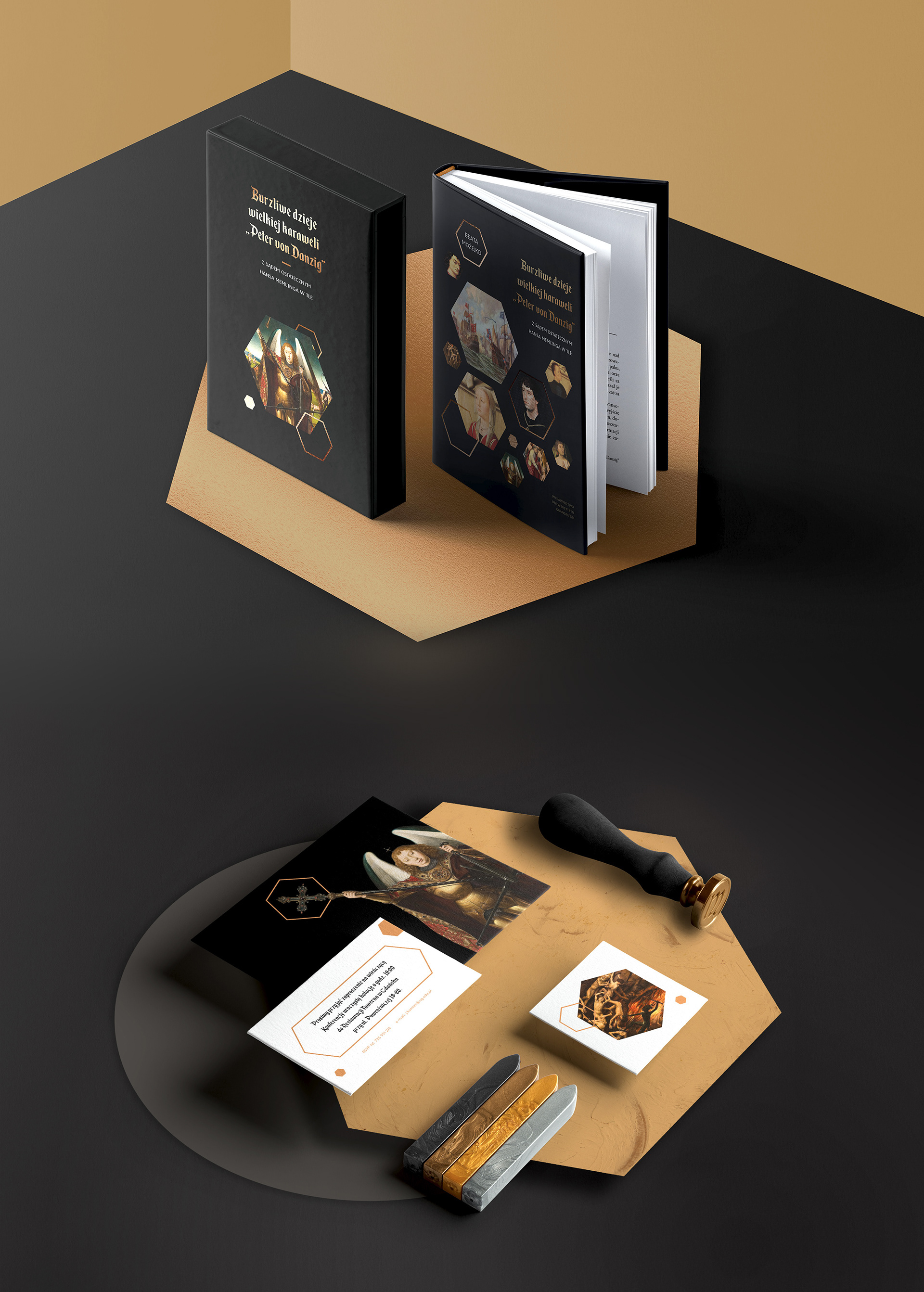
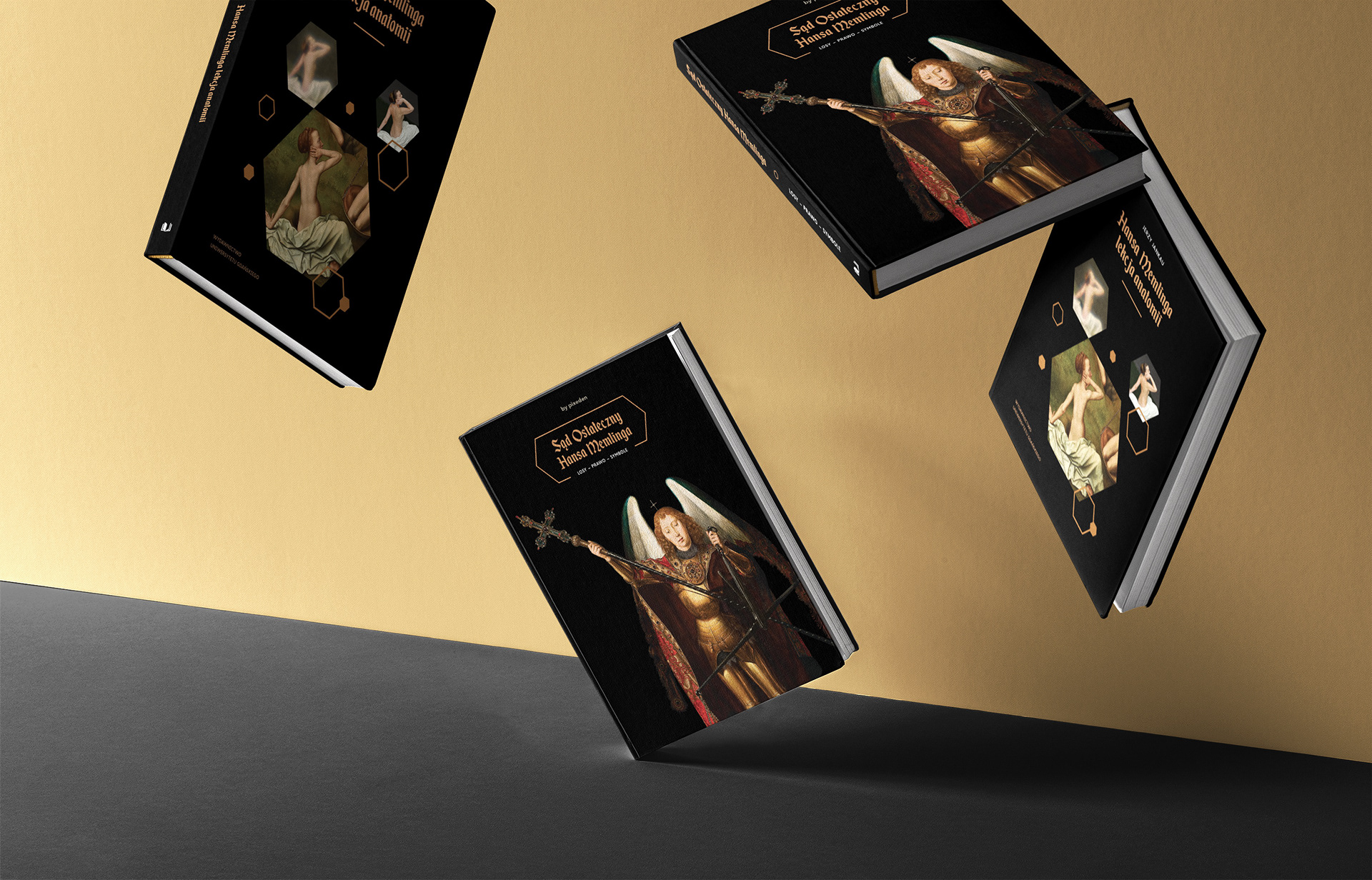
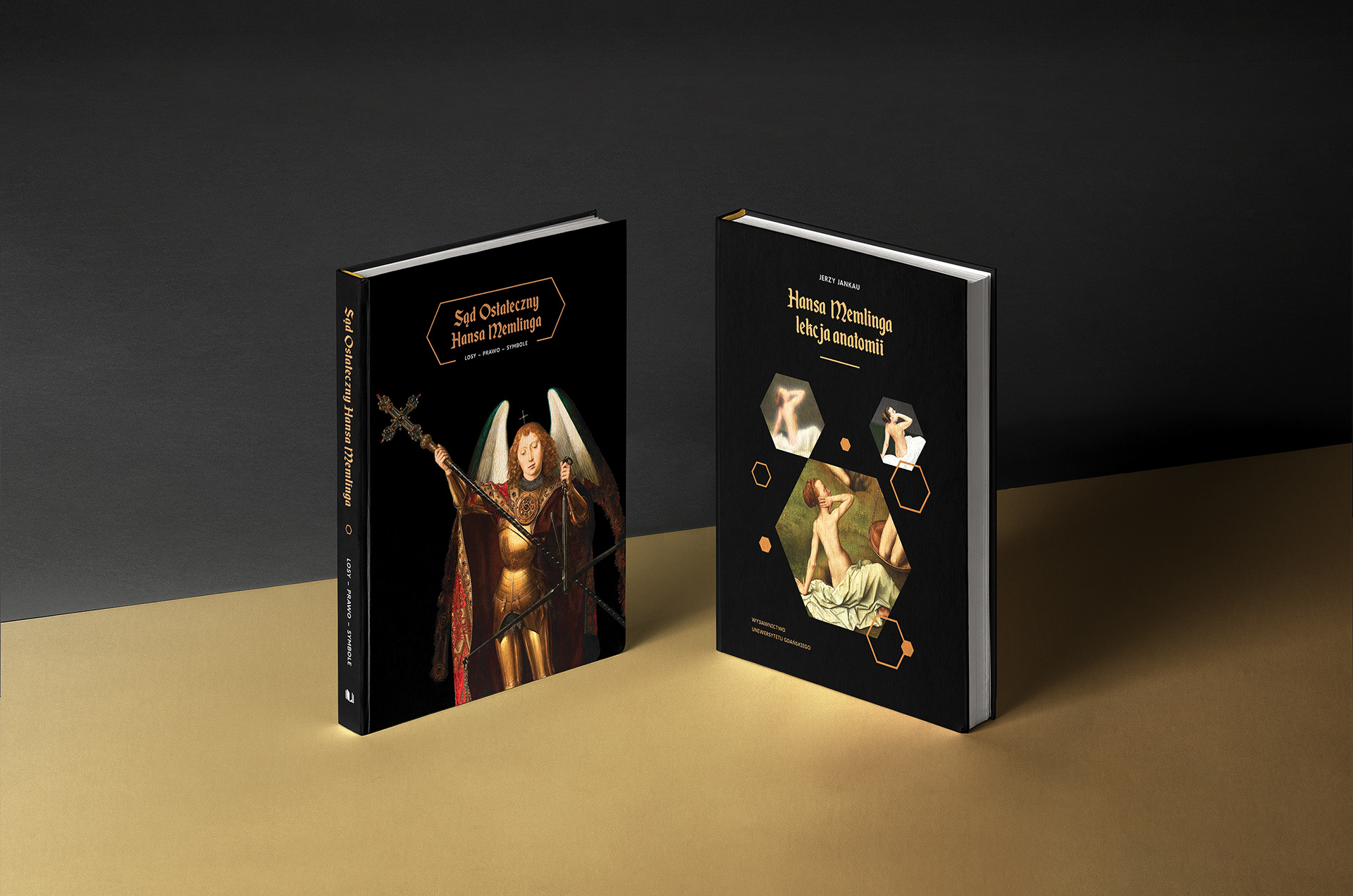
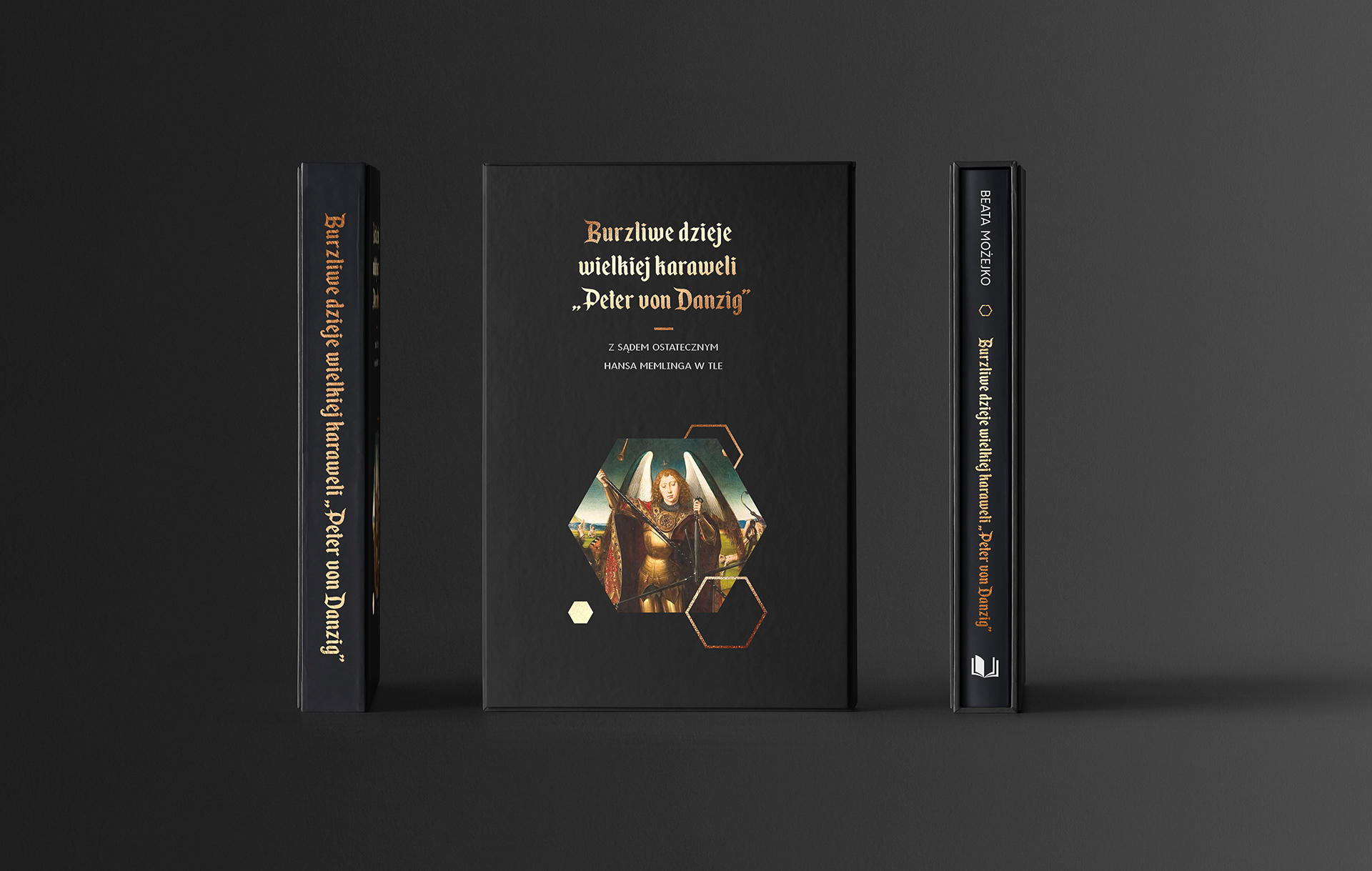
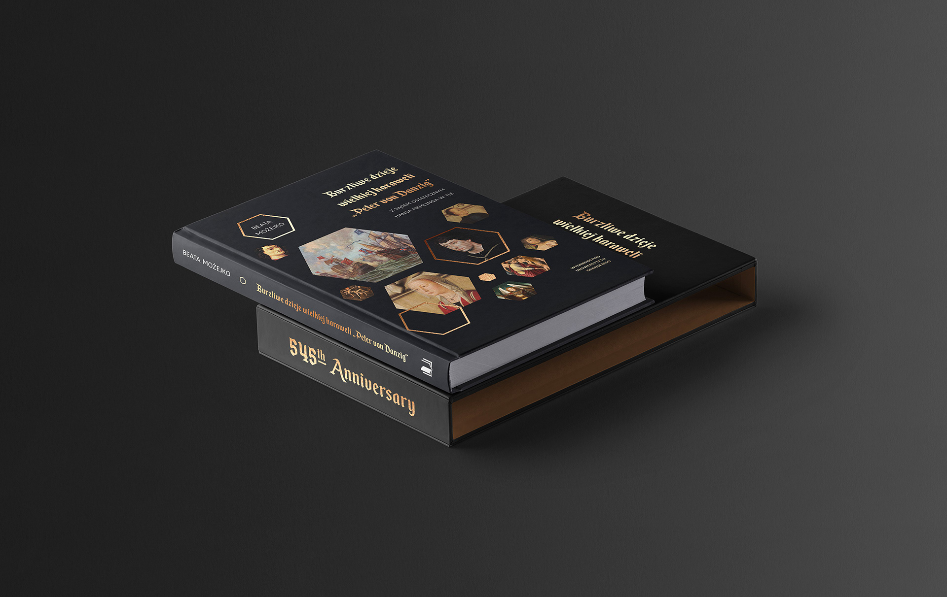
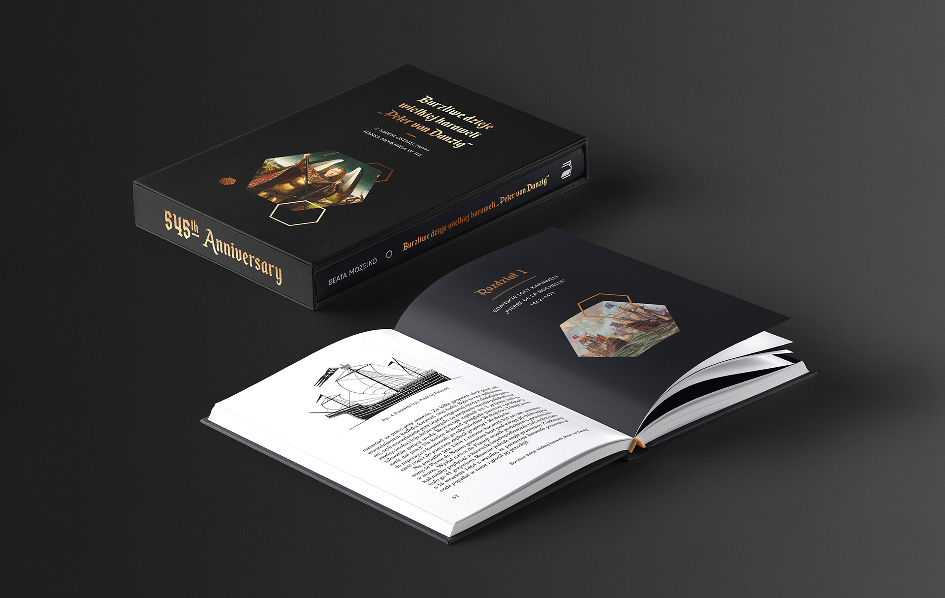
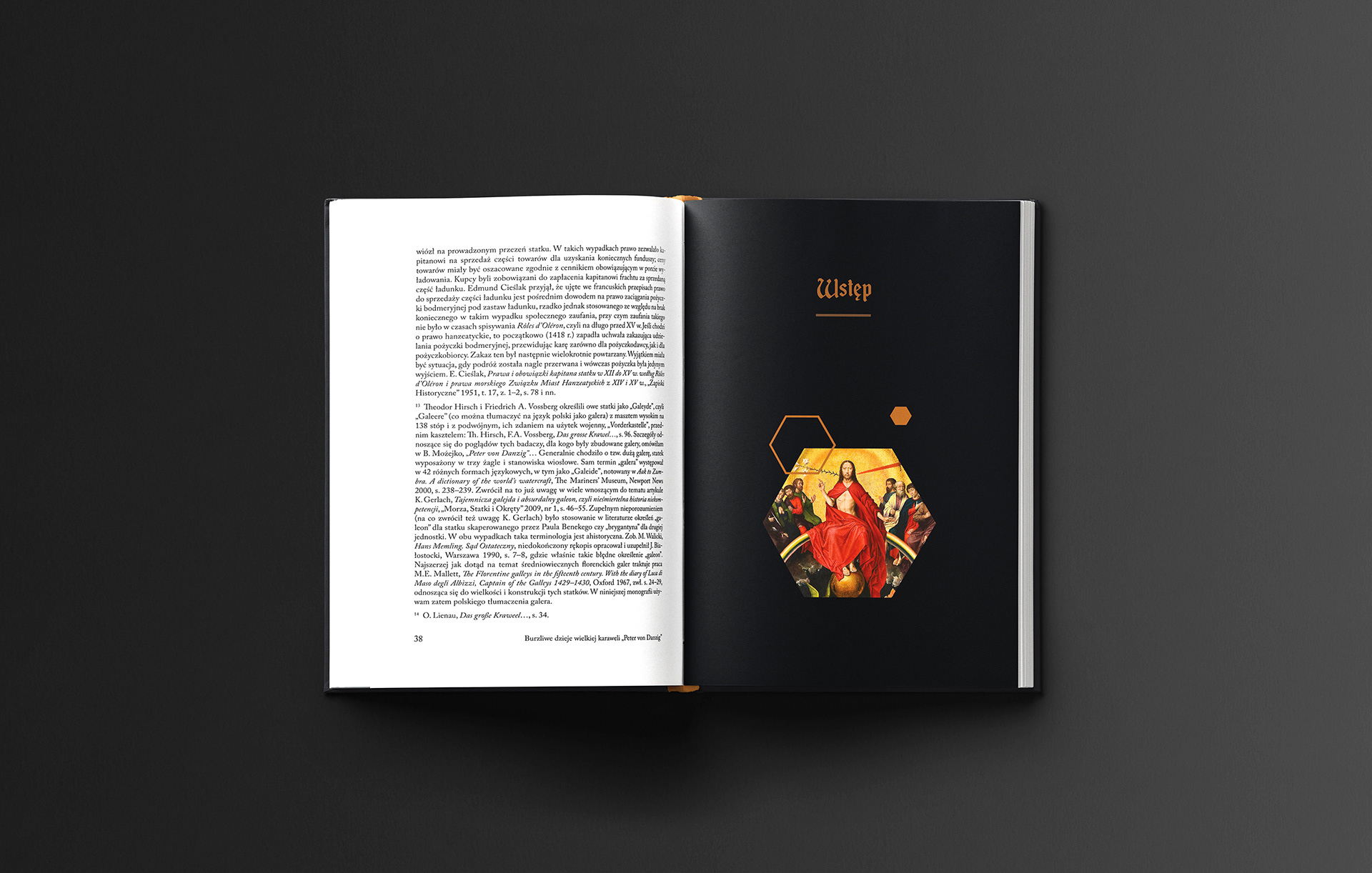
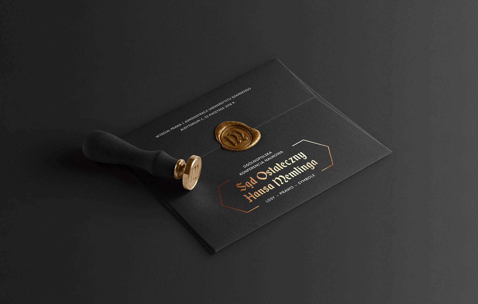
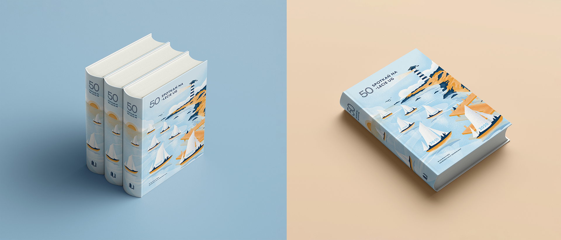
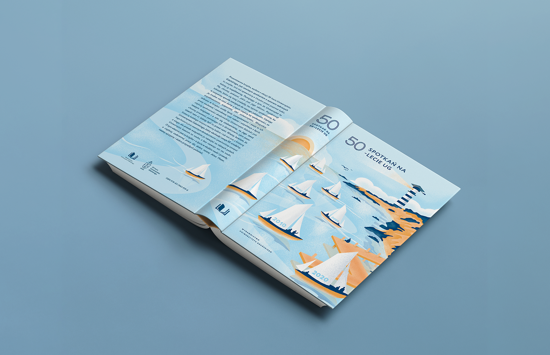
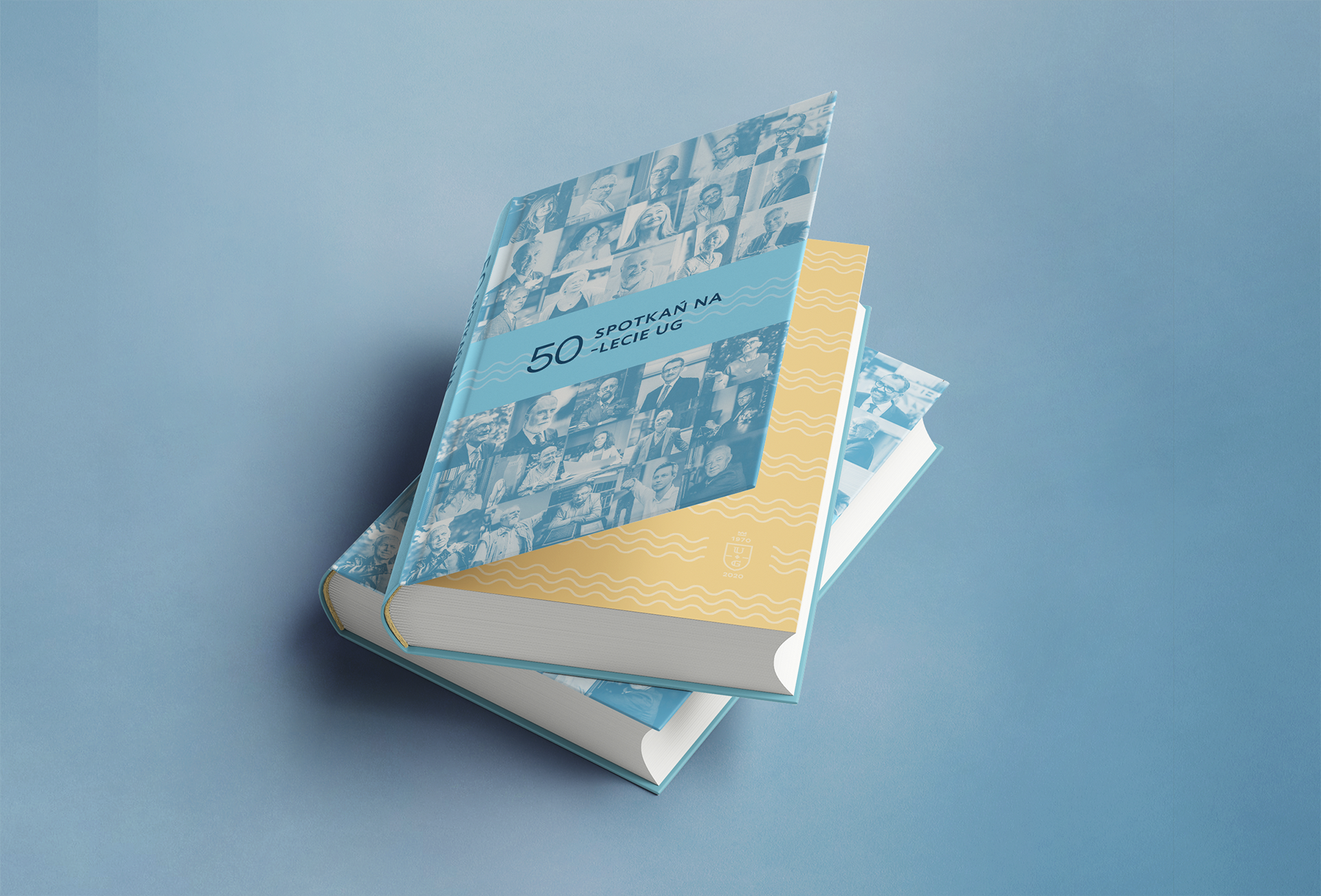
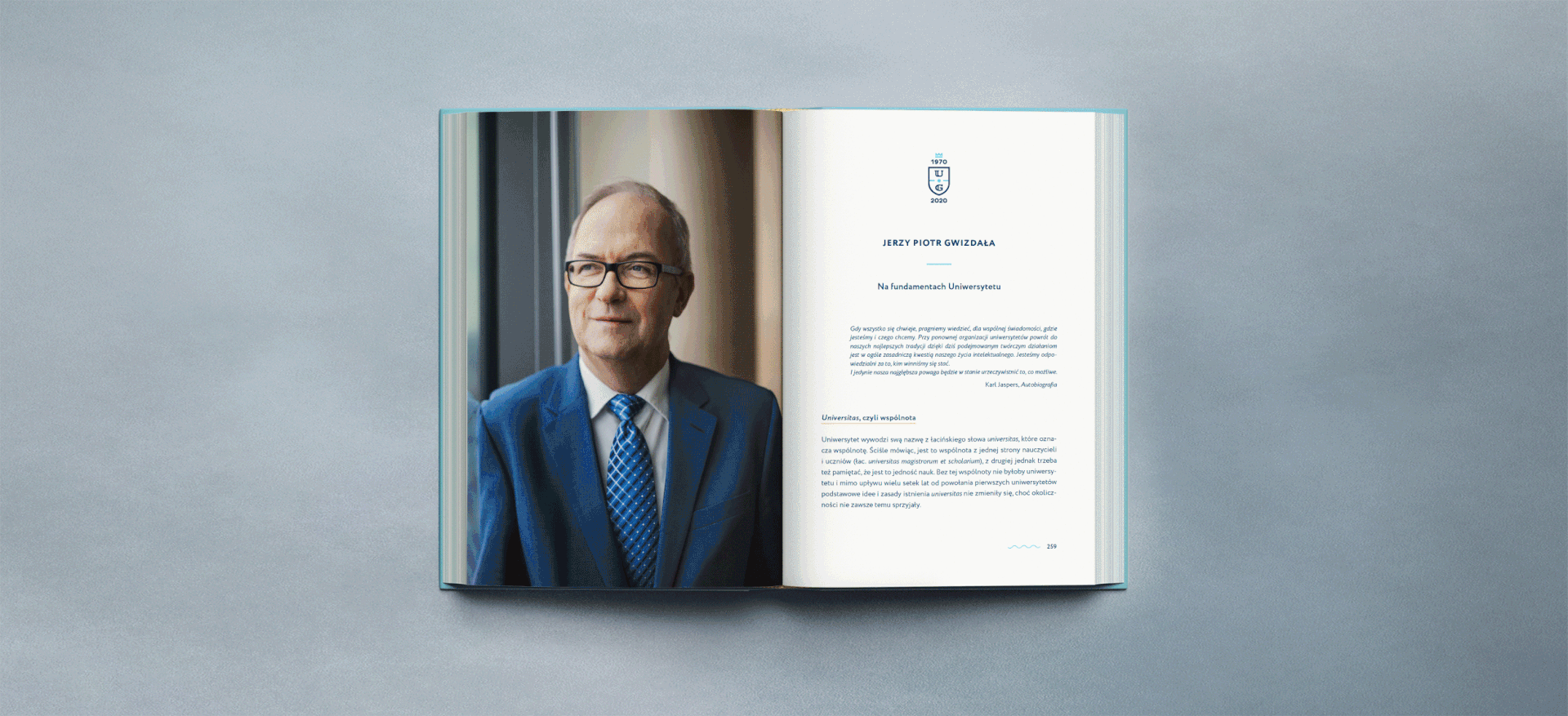
When the brief becomes a 900-page book

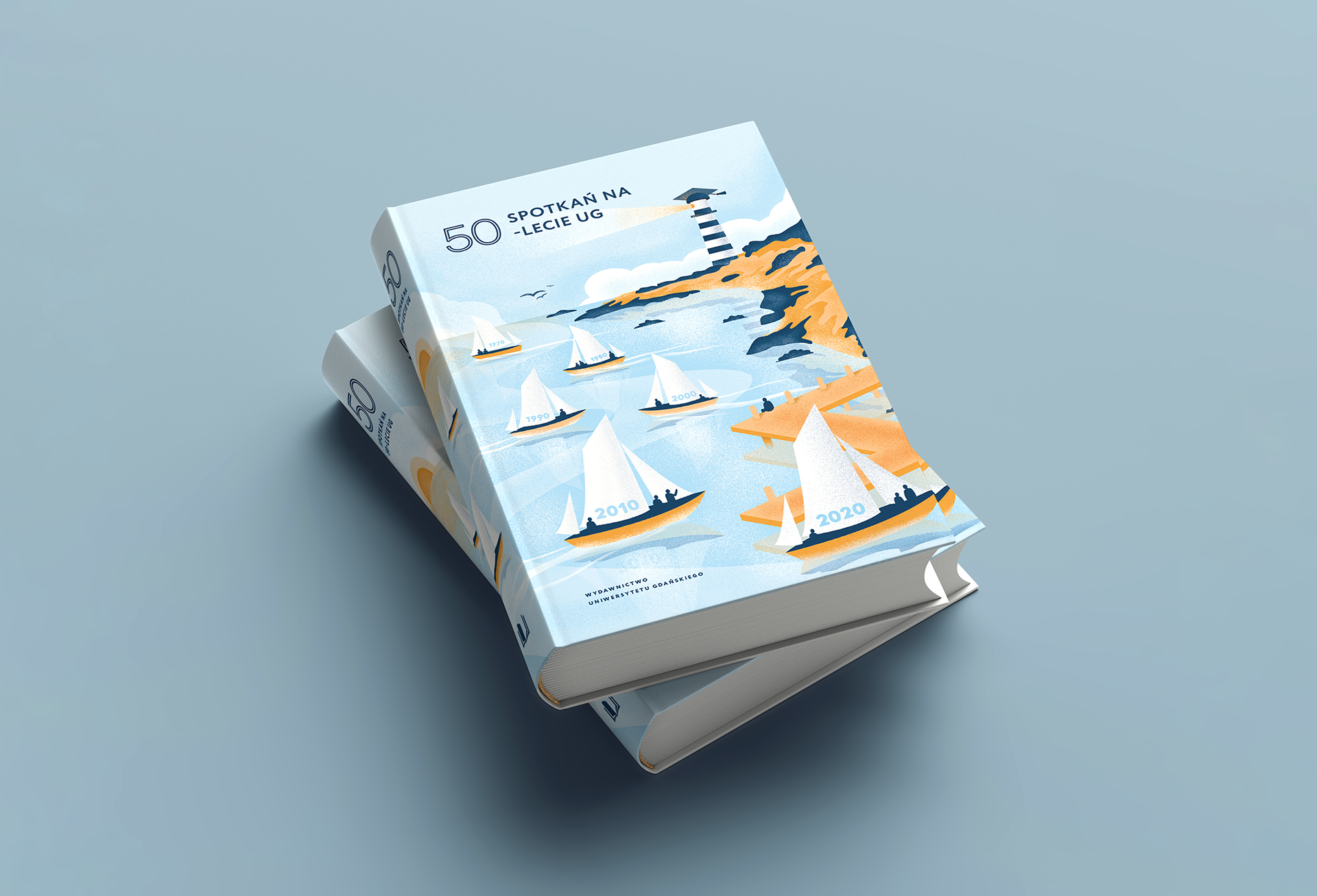
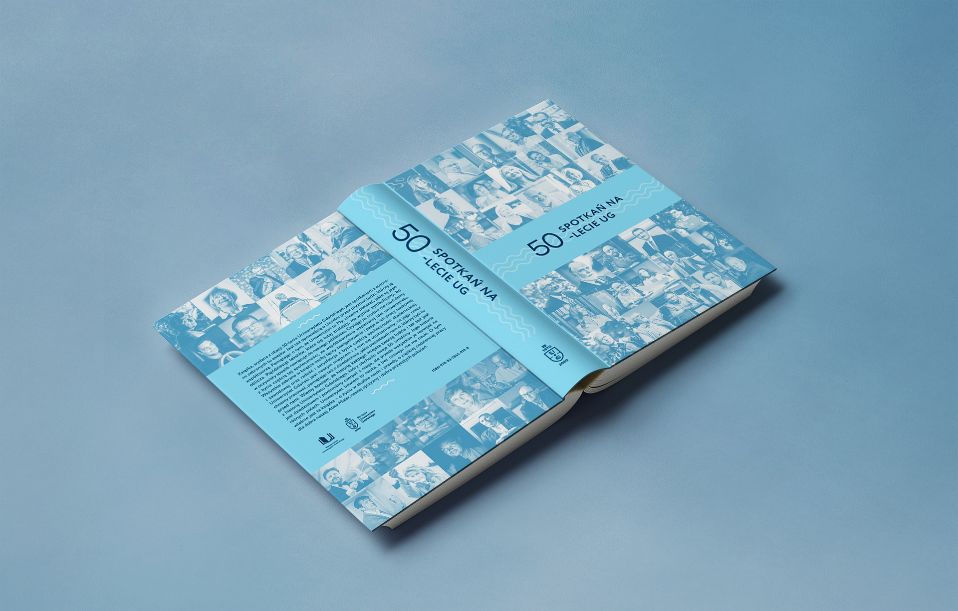
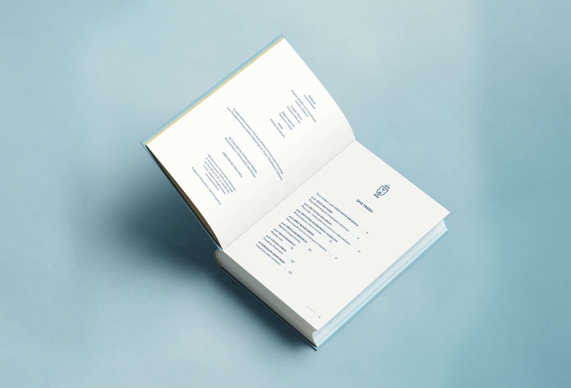
Work on the anniversary book began over a year before publication — over 400 portrait sittings for 50 significant university figures needed to be shot, edited, and integrated into a consistent layout. The first cover concept, a custom Procreate illustration mapping each decade as a vessel leaving port, was rejected in review; rather than discarding it, I repurposed it across posters, notebooks, and an exterior building banner. The final cover resolved to the 50 portraits with a controlled light blue tint, and every layout decision across the 900 pages — quote treatment, portrait grid, article spacing — was governed, not improvised. The book's promotion was held September 30, 2019 at the Main Library of the University of Gdańsk, alongside the jubilee academic year inauguration.

Anniversary book overview Book first concept illustration — each decade as a vessel leaving port Book illustration sketch Book final cover — 50 portraits with light blue tint Book layout typography Book layout pages Book portraits layout Book quotes design

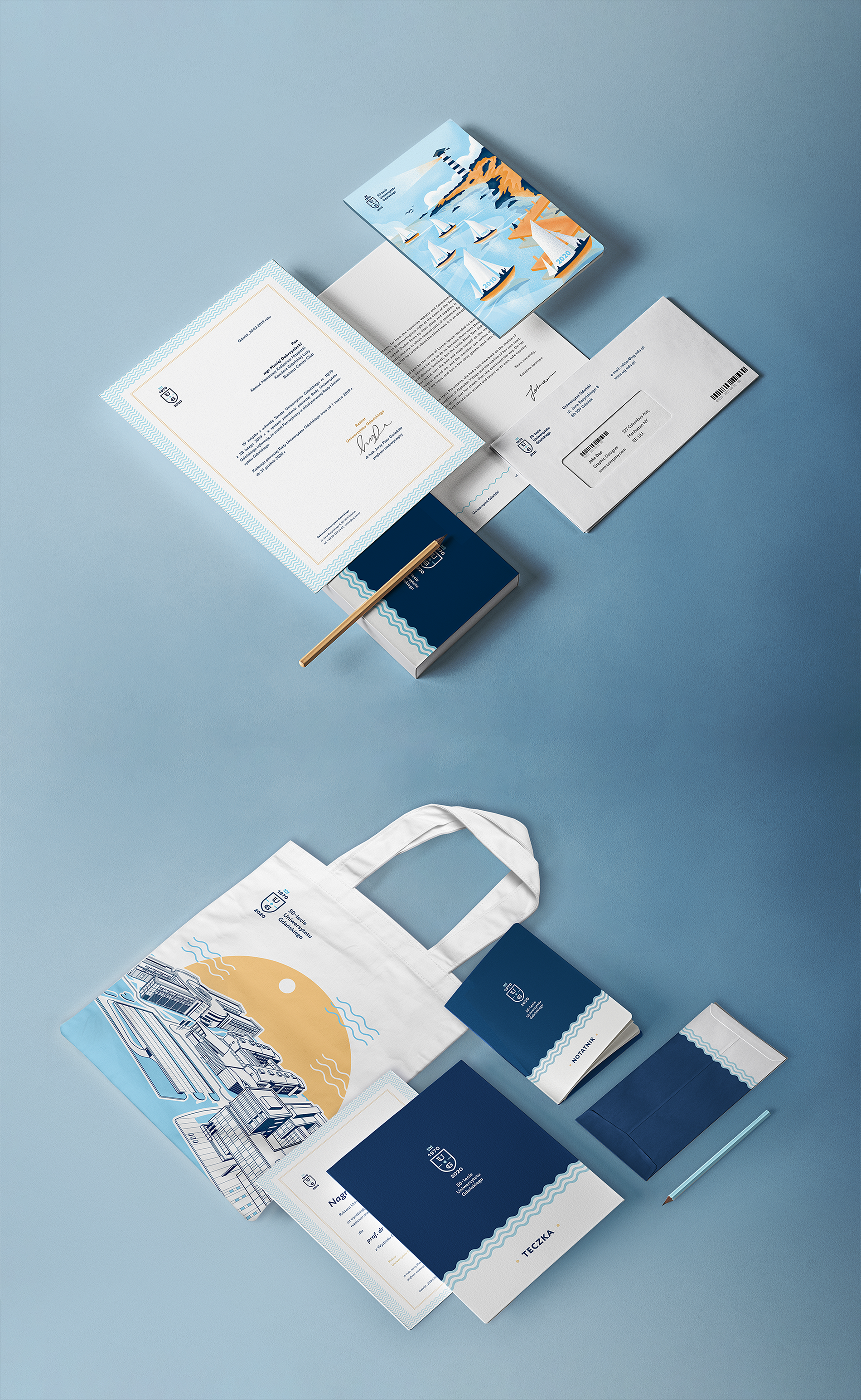
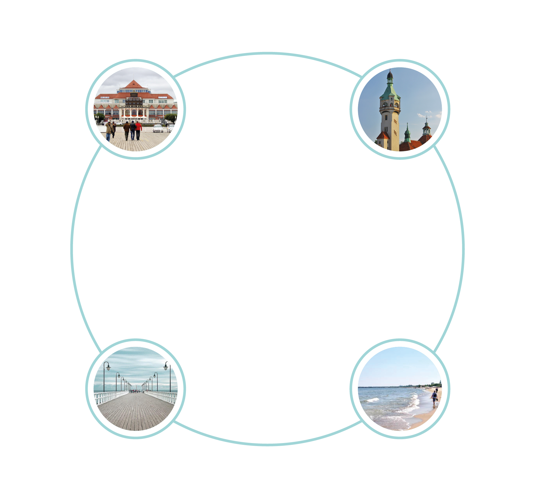
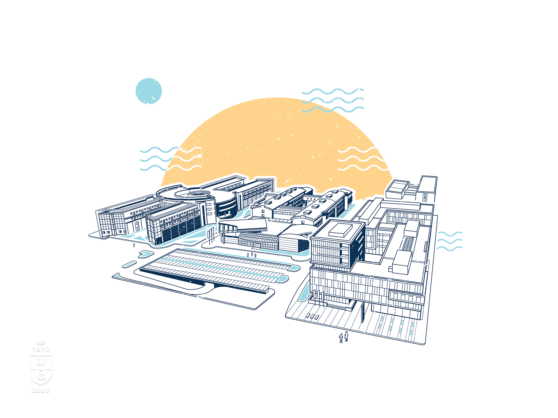
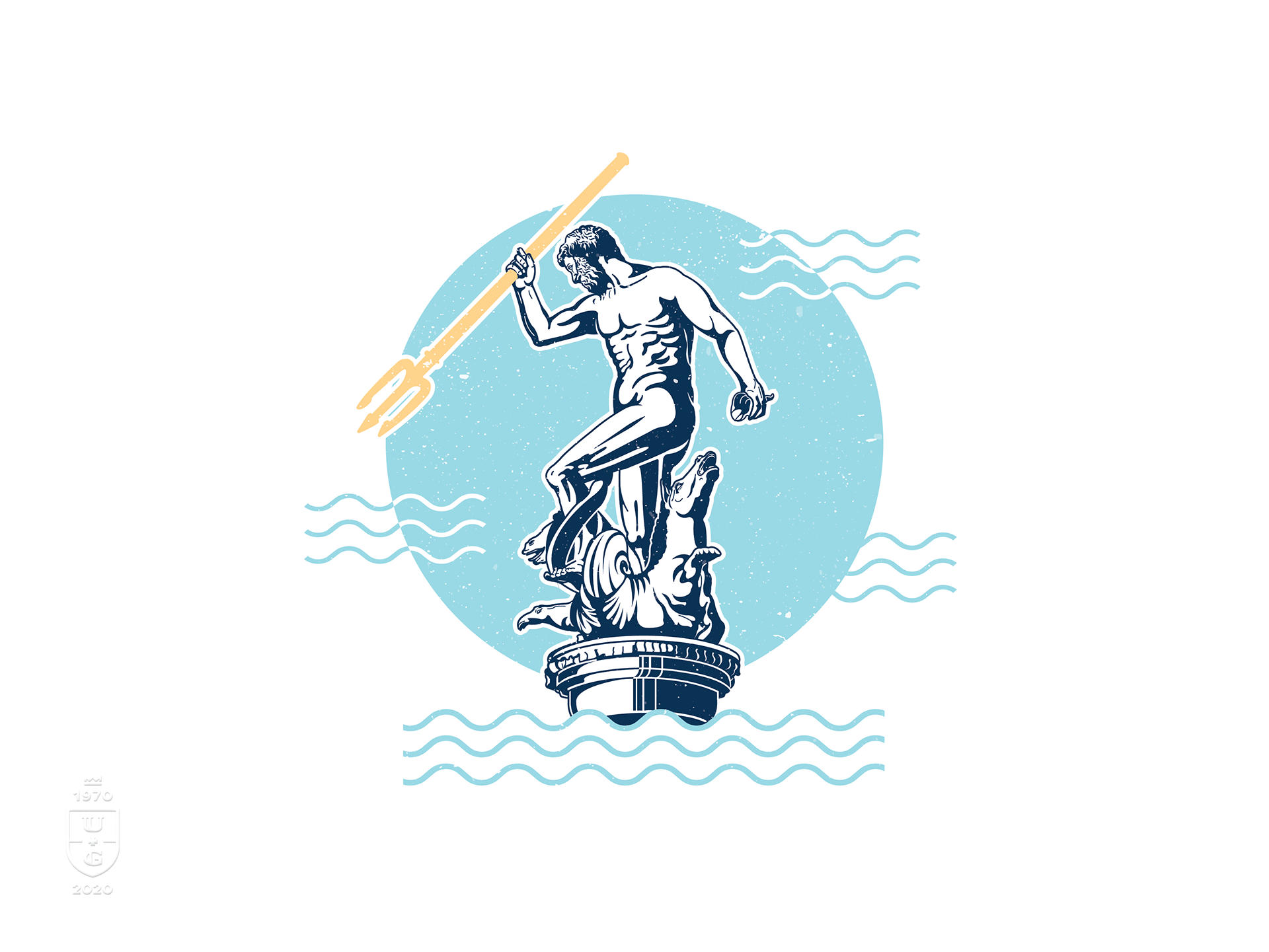
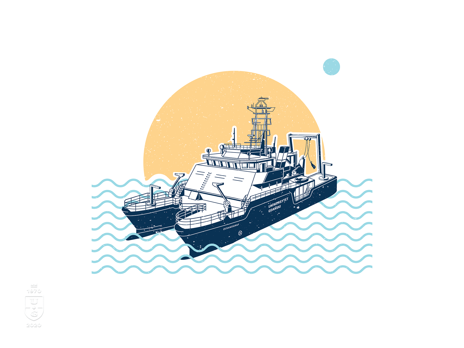
From maritime illustrations to street campaign

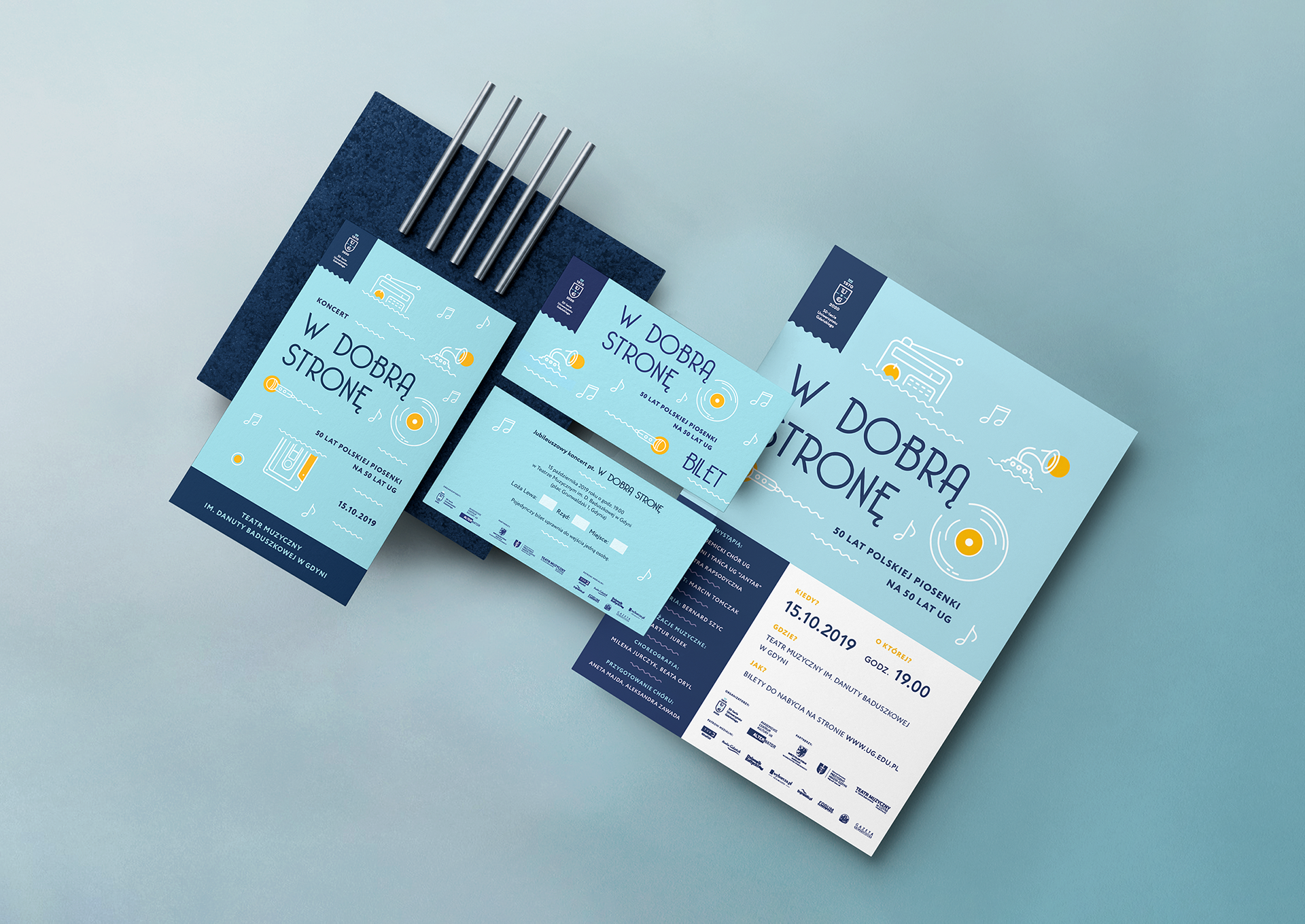
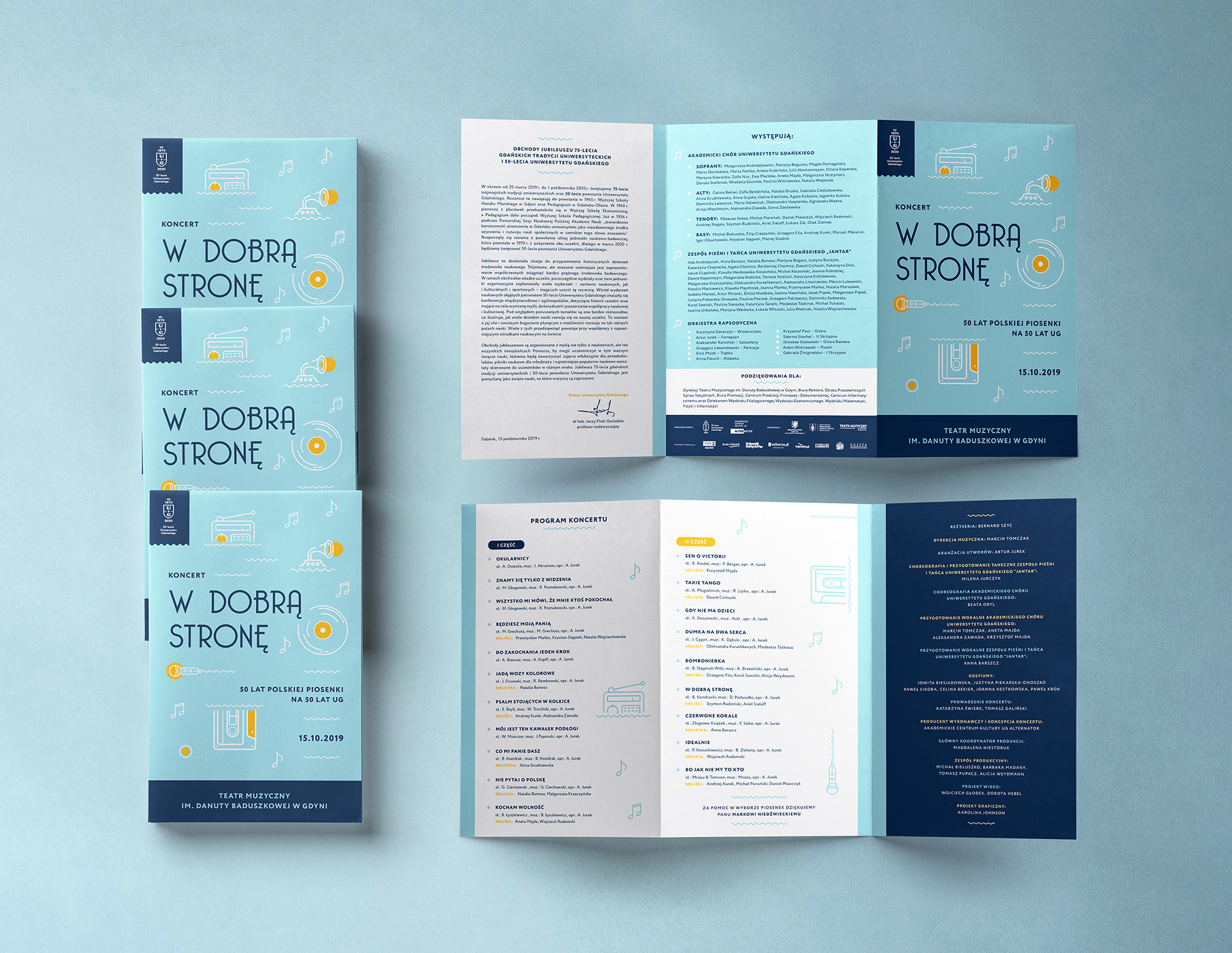
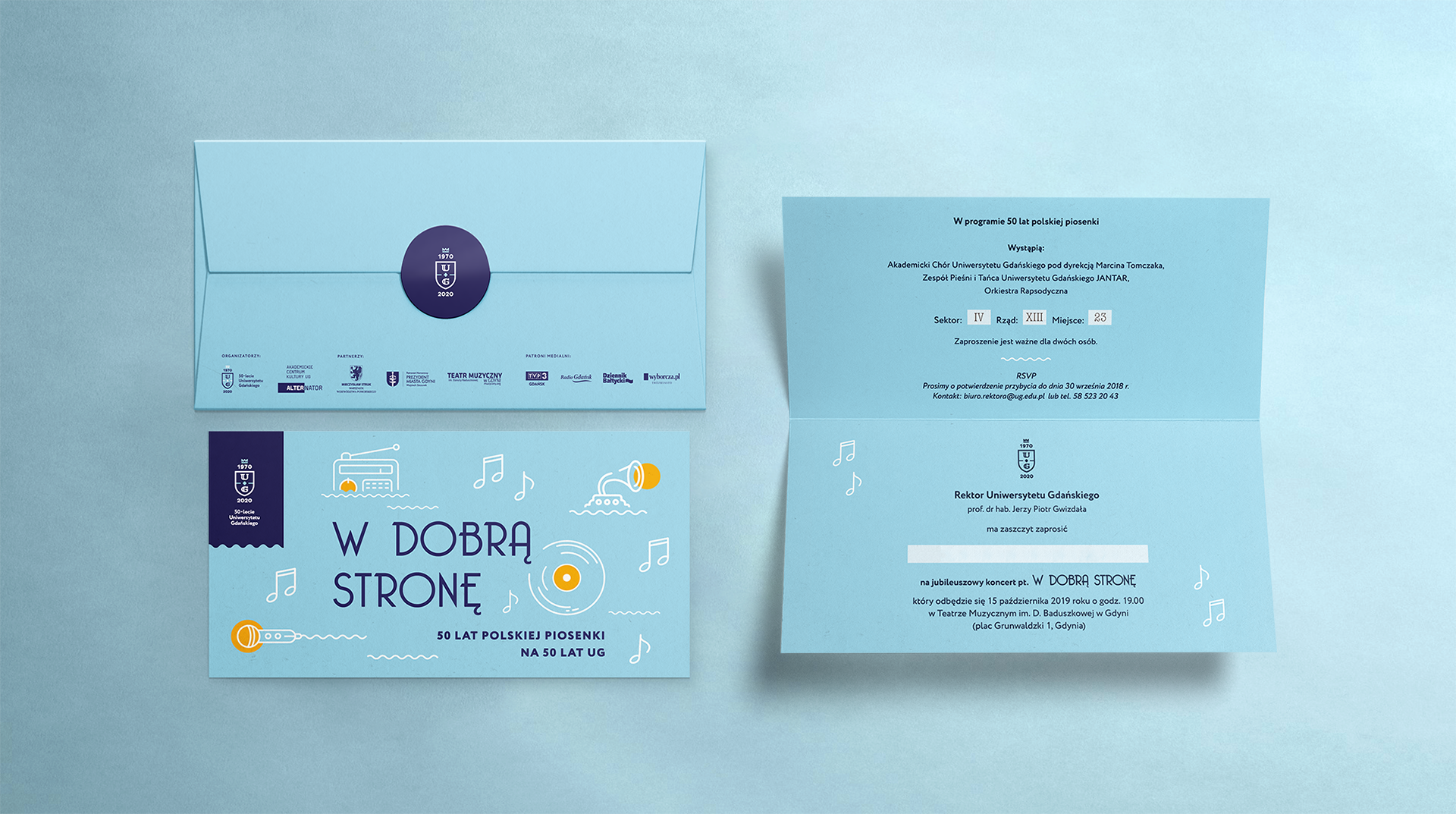
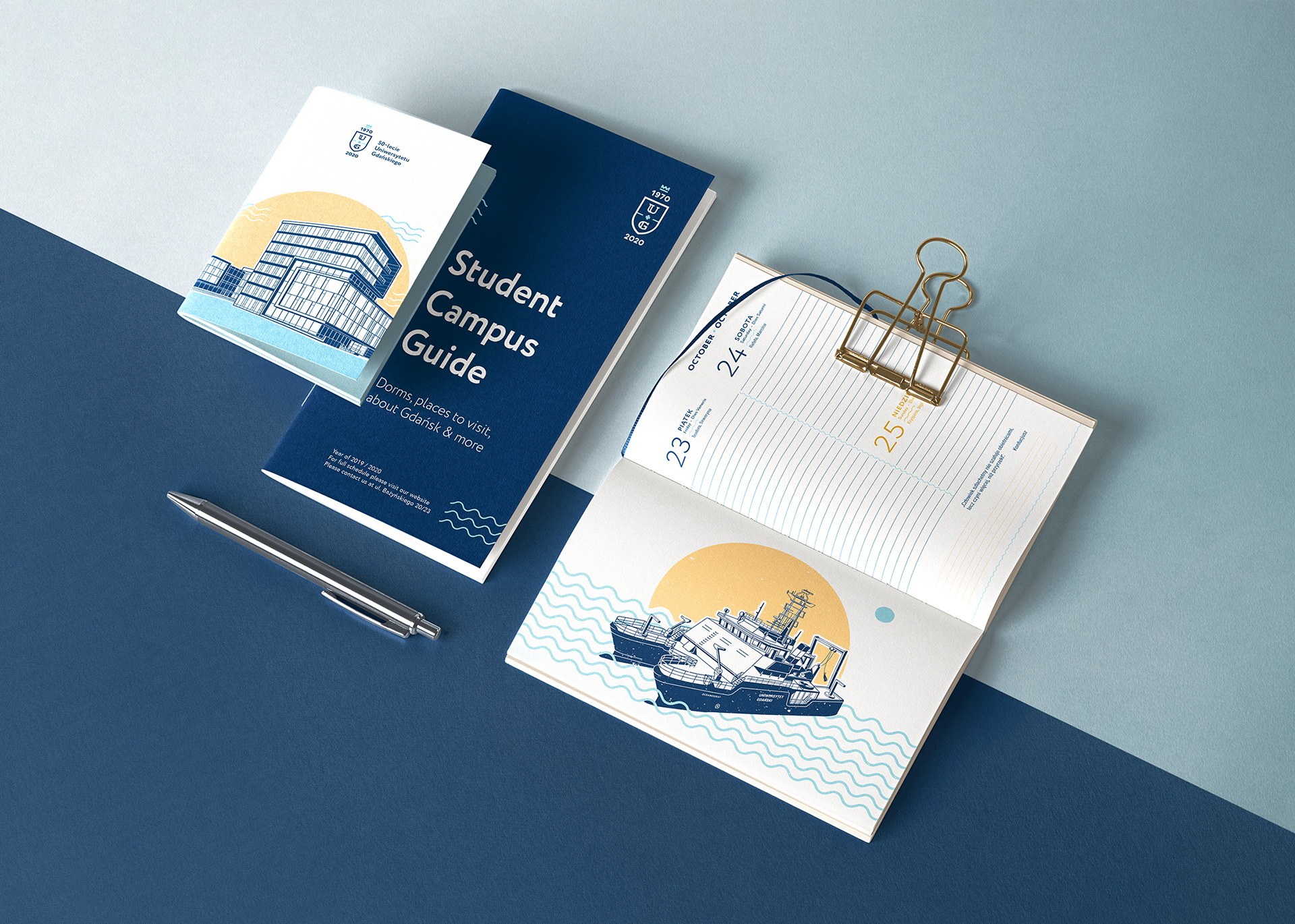
The university's maritime identity — anchored in its motto in mari via tua and its ownership of the research vessel Oceanograf — gave the illustration series its subject matter: four campus landmarks rendered in a vintage paper press technique, debossed onto over 150 high-quality prints by a local studio. These ran alongside merchandise, apparel, and notebooks. Concert materials for the October 15, 2019 anniversary concert at Gdynia Musical Theatre — featuring the UG Academic Choir and folk ensemble "Jantar" performing music spanning five decades — were designed within the same governed system: program, invitations, tickets, and poster.

Illustrations on materials Illustrations framed prints
University of Gdańsk — Main Campus illustration Neptune sculpture — symbol of Gdańsk illustration Academic Office Building illustration Oceanograf — University's scientific ship illustration
Concert materials overview Concert program Concert invitations Concert tickets
Book promotion animation Book promotion event — Main Library, September 30 2019
Photo gallery

The identity launched in early 2018 and held without revision through a COVID delay that moved the main anniversary ceremonies from March 2020 to March 2021 — a full three-year run on a single visual system.

Outcome

A single visual system governed the university's most public period: from the opening celebrations on March 20, 2019 through the postponed main anniversary in March 2021. It ran across events, 3 campuses, and a community of 26,000+ students and 1,700 academic staff.

Publishing Identity Academic Branding 2018–2019

A publishing identity for Poland's most contested painting

Three books, one conference, one visual system — built for a 550-year legal dispute over a Flemish masterpiece, still in print as a series today, and the foundation of a university research centre established four years later.
3Books, one visual language
550 yrLegal dispute duration
2022Research centre established
ActiveStill in print as a series
Project overview — Hans Memling publishing identity system

A painting with five centuries of unresolved legal status

Hans Memling's The Last Judgment is not a quiet altarpiece. Created around 1468 in Bruges for Florentine banker Angelo Tani, it was seized at sea on April 27, 1473 near Dunkirk — when Gdańsk privateer Paul Beneke attacked a Medici galley, killing 8–13, and took cargo worth 30,000–40,000 florins, including the triptych. Beneke donated it to the Church of the Blessed Virgin Mary. Since then: Tsar Peter I tried to claim it as a "gift," Napoleonic forces transported it to the Louvre, the Soviets seized it during WWII and held it in St. Petersburg until 1956. Today it hangs in the National Museum in Gdańsk — Poland's most important artwork after Leonardo's Lady with an Ermine. In April 2018, the Faculty of History and the Faculty of Law and Administration at the University of Gdańsk organized a scientific conference marking the 545th anniversary of Beneke's act: The Last Judgment of Hans Memling — History, Law, Symbols. My brief was a book cover and a conference identity. What it became was a governing visual system for an academic publishing program.

Three books, one visual language

The series spans three publications, all from Wydawnictwo Uniwersytetu Gdańskiego, all under the same visual identity:

Burzliwe dzieje wielkiej karaweli "Peter von Danzig" — Beata Możejko, 2018, 188 pages. A rigorous primary-source study of the caravel at the center of the painting's arrival in Gdańsk, tracing economic, cultural, and geopolitical dimensions across Northern European waters. This was the first cover and the visual anchor for everything that followed.

Sąd Ostateczny Hansa Memlinga. Losy – prawo – symbole — Kamil Zeidler, Beata Możejko, Jerzy Zajadło, Joanna Kamień, 2019, 304 pages. The conference proceedings — examining the painting's provenance, legal status, symbolism, and relationship to canon law across four authors from two disciplines.

Lekcja anatomii u Hansa Memlinga — Jerzy Jankau, 2019, 156 pages. A plastic surgeon's analysis of the triptych's anatomical accuracy — an interdisciplinary perspective that required the same visual system to hold across a radically different subject matter and author.

The visual identity had to work across history, law, and medical science without fragmenting. Each cover reads as part of a coherent series; each stands as an independent academic object. All three are still sold together as a bundle by UG Press.

Book cover — Burzliwe dzieje wielkiej karaweli Peter von Danzig (2018)

A conference identity that spanned two faculties

The April 2018 conference identity extended the series' visual language across printed materials — spanning historians and legal scholars from two distinct faculties with different institutional cultures. The system had to communicate academic authority to both audiences while carrying the gravity of a 550-year dispute about whether a sea seizure constitutes piracy or legitimate caperism.

Conference materials 1 Conference materials 2 Conference materials 3 Conference materials 4 Conference materials 5 Conference materials 6 Conference materials 7 Conference materials 8 Conference materials 9 Conference materials 10 Conference materials 11 Conference materials 12

A research centre built on this foundation

The 2018 conference and its publishing program didn't close — they compounded. In October 2022, the University of Gdańsk formally established the Memling Research Centre, with a mission to continue and promote research on The Last Judgment and its surrounding humanistic questions: restitution, ownership, exhibition, and the painting's place in cultural memory. The Centre's five research areas — Historical, Legal, Cultural, Literary, and Philosophical — map directly onto the interdisciplinary publishing program the visual identity governed from 2018. The system helped give coherent form to a fragmented research agenda before it had an institutional name. All three books are still the MRC's official Book Corner — the covers designed in 2018–2019 are the face of an active research institution today. The MRC operates within the Fahrenheit University Association and the European University of the Seas (SEA-EU) consortium.

Outcome

A single book cover became a visual system governing three publications, one conference, and an institutional research program that is still active today. The series remains in print as a bundle from UG Press.

City Tourism Brand Identity System 2018–Present

Sopot: brand governance rooted in the city's own geography

A coastal city's outdated tourism identity rebuilt from its own geography — four landmarks, three Baltic colors, a governed system — and still the active face of an award-winning destination seven years later.
7 yrSystem still active
110+Member organisations governed
30+Tourist card partners
2024National tourism award
Early logo sketches and proposals — Sopot Tourist Organization Logo in photo context — Sopot city environment

An outdated logo is a trust gap, not a taste problem

Sopot is one of Poland's most significant tourist destinations — home to the longest wooden pier in Europe, a major Baltic health resort, and the continent's second-largest song festival. The Sopot Tourist Organization, founded in 1997 and governing 110+ member organisations including hotels, restaurants, museums, and transport companies, commissioned a brand refresh in 2018 because its visual identity had fallen behind the destination itself. The timing was institutional, not just aesthetic: the organisation was officially renamed SOT (Sopot Tourist Organization) on November 2, 2018 — the rebrand and the restructuring happened together. Working alongside Studio Spectro's art direction, the brief was to close the gap with a system durable enough to govern 110+ member relationships and run across print, outdoor, and digital simultaneously.

Four landmarks, one mark

The logo encodes four specific Sopot landmarks — the Lighthouse, the Spa House, the Pier, and the Baltic Sea — into a single geometric mark governed by a square grid. Horizontal and vertical versions were specified from the start, extending the mark's range across applications without compromising its structural integrity. The first concept was selected in review and taken directly into the brand system — the brief was precise enough that the logo didn't need to find itself through iteration.

Logo versions — horizontal and vertical Logo grid construction Logo symbolism — four landmarks encoded Logo applications across media

Color derived from place, not preference

The three-color palette — light blue (summer skies), yellow (sandy beaches), navy blue (Baltic Sea) — was grounded in Sopot's physical environment, giving each color a referent that extended beyond taste. Permissible tints were defined at a 30% ceiling; black and white were specified as auxiliaries only, keeping the palette from fragmenting across vendors and member organisations. The primary typeface, Semplicita Pro, handled scale from body text to outdoor advertising; Now served as the geometric complement for identification applications.

Color scheme — three Baltic colors Color applications across materials
Typography — Semplicita Pro and Now typefaces

Brand book to Baltic street campaign

The brand book codified every rule for external vendors and city departments — the system had to be transferable across 110+ member organisations without design oversight on every execution. The Sopot Tourist Card extended the identity into a functional product for visitors, redeemable at 30+ partner venues across the city and now available as both a physical card and a mobile app. The street campaign made the identity visible at city scale from early 2019.

Brand overview Brand photo context in city environment Brand materials Sopot Tourism Card
Brand book cover Brand book pages Brand book layout
Brand applications Marketing materials Street campaign in Sopot

A system still governing an active destination

The identity launched in 2019 and has not been replaced. The logo runs across visit.sopot.pl — SOT's official tourism portal — in the header, footer, and all digital communications. The Sopot Tourist Card, one of the original brand deliverables, is still issued to overnight visitors who pay the spa fee, now backed by 30+ partner venues. SOT also operates Sopockie Pamiątki — an online souvenir shop where the identity runs across branded merchandise sold citywide.

In 2024, the Sopot Tourist Organization was named Manager of the Polish Tourist Brand Sopot by the Ministry of Sport and Tourism — a national recognition of Poland's most attractive tourist destinations. The visual identity designed in 2018 is the face of that award today.

Outcome

A governance system designed in 2018 is still the active identity of a nationally recognised tourism destination seven years later — live across a 110-member organisation, a tourism portal, a Tourist Card with 30+ partners, and a souvenir shop.

District Identity Pattern System Łódź

A district's industrial memory, made into a visual system

Visual identity for one of Łódź's oldest districts — where a single angled stroke, a brick-red palette, and an architectural pattern library turned a century of industrial character into a governed visual language.
Logo wordmark — Stare Polesie Brand overview — Stare Polesie identity system

A century-old district with no modern visual language

Stare Polesie is one of the oldest districts of Łódź — a city defined by industrial brick, dense cultural history, and a street grid shaped by rural land composition that predates the city itself. The brief was to create a visual identity that named and governed this character: not as nostalgia, but as a system capable of running across signage, print, merchandise, and city-facing communication. Working in a team of five, the design work was led across logo, pattern, and identity applications.

Brand overview 2 — identity across applications Brand materials — Stare Polesie

The angle that carried the whole system

The logo's defining stroke is angled — a direct reference to the historical rural land composition of the district, uniquely oriented on the city map. This was not a decorative choice: the angle is the system's structural signature, appearing consistently wherever the identity needs to assert its origin. Black, white, and dark red — the color of Łódź's industrial brick — form the palette. Every element traces back to a physical referent in the district; there are no arbitrary marks in this system.

Architecture as pattern vocabulary

The pattern library was derived from local architectural elements — pulled directly from the physical fabric of the district and systematized for application, not abstracted from it. A set of icons representing the district's key cultural buildings extended the vocabulary further, creating a portable system capable of representing Stare Polesie beyond its own borders. These elements mixed with the core mark to produce a range of print and merchandise outputs governed by the same visual logic.

Pattern and architecture — derived from local buildings Full spread — pattern system applied Architectural detail 1 Architectural detail 2 Architectural detail 3 Architectural detail 4

A living identity across district touchpoints

The identity ran across branded merchandise, printed materials, and a district calendar. Its flexibility came from its architecture — a tight rule set governing mark, pattern, and color allowed varied outputs without drifting from the source material.

Gadgets and branded merchandise Icons and pattern system Application mockups
Identity detail 5 Identity detail 6
Brand application in district context Printed detail 1 Printed detail 2
District calendar — identity applied to annual publication

Photo Gallery

Gallery photo 01 Gallery photo 02 Gallery photo 03 Gallery photo 04 Gallery photo 05 Gallery photo 06 Gallery photo 07 Gallery photo 08 Gallery photo 09 Gallery photo 10 Gallery photo 11 Gallery photo 12

Outcome

A governed visual identity for one of Łódź's oldest districts — built from the physical fabric of the place itself. A tight rule set governing mark, pattern, and color produced varied outputs without drifting from the source material.

Get in touch

Let's build something

that holds.

Back to top